Originally posted by Tom Slick: Looks good... but now add a car, should be in the same negative effect or highlighted outline one. let me see if i can find a pic of what i'm talking about.
ok, on short notice this is sortof what i'm talking about. different color and a Fiero of course
I'll let ya'll decide. A majority of the Bat Club members rule I guess... Don't know about that negative car thing... looks like too much work ha ha.
Whenever you guys decide on a stopping point on the editiing... I guess, Kevin.... you need to send the various candidates it to the email list for a final vote? -terry
IP: Logged
08:43 PM
Flamberge Member
Posts: 4268 From: Terra Sancta, TX Registered: Oct 2001
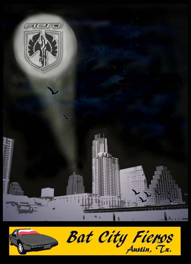
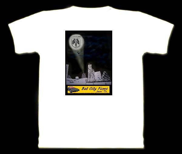
Of all the ones so far .... that's the one I like also ( I really liked kevin's suggestion of the texas flag in the car window.) I also like that the origin of the bat light is shown,,, which I've always thought that particular building was very Gothic.... which I why I chose it to be the origin as oppsed to one of the others.
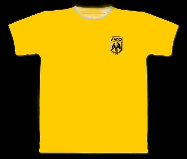
while I like the bat fiero logo - I'm thinking I prefer to stick with the more recognizable official Fiero Logo - the bats are already represented in flight , in the wording and also in a "Bat Light" - I think the Fiero aspect needs to be more in balanced with that - hence my preference for the traditional Fiero logo here.
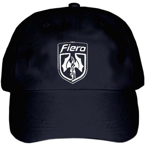
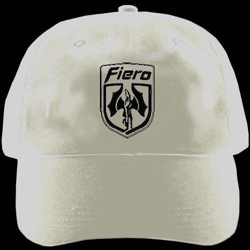
That said... I'm thinking I'd really love a baseball cap with that "Bat" Fiero Logo stitch on it - now that would be cool.
[This message has been edited by boomme (edited 06-20-2011).]
IP: Logged
11:27 PM
MarineWife1981 Member
Posts: 50 From: Austin, Texas, USA Registered: Feb 2011
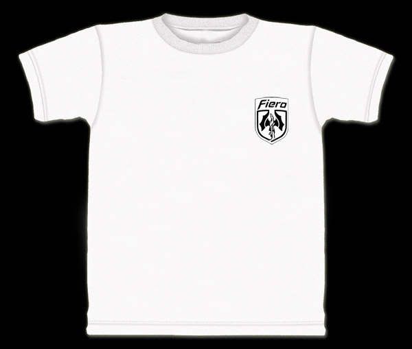
i also prefer the fiero symbol unchanged on the tshirt to keep the balance since we have the space on a tshirt to do so. other than that, whether we use the negative of the 88GT or the texas flag window... idk, i can't decide.
BUT i think we should def have the bat-winged Pegasus on smaller items such as baseball caps or other items.
btw, very awesome work on all the designs. i am def jealous of y'all's abilities!
**EDIT** on second look, i think i prefer the fiero with texas flag windows because i prefer that body style. to me it's the look that makes fieros stand out from the others. *shrug*
[This message has been edited by MarineWife1981 (edited 06-20-2011).]
Thanks, Don. Without making his head swell too big it started with Revin. And people chipped in after that and everything sort of fell into place. It will be so cool if we are able to caravan into the next Ruckus up in Dallas. Mike
IP: Logged
07:44 AM
Flamberge Member
Posts: 4268 From: Terra Sancta, TX Registered: Oct 2001
Okay I'm on board with this one too. I agree the bat wing Fiero logo would be great on hats or even the front pocket area of a shirt, but is probably overkill on the image above. Also the Texas flag int he window of the Fiero is cool. I didn't really notice it earlier. Nice work there!
IP: Logged
08:16 AM
Flamberge Member
Posts: 4268 From: Terra Sancta, TX Registered: Oct 2001
Could you make the Fiero and name on top? picture on bottom. just to see......
I will agree about the "bat Logo" for like hats, stickers( for the kids), maybe even on a shirt for a special cruise Do not throw that logo away!! I love it!
Don, you know I have always wanted to have some fellow Austin people at the shows we go to. Well now we have them! You should have seen it. After everyone got to know each other, there were little "click" groups forming I really do think we have a great selection of people with skills that rival any other clubs abilities.
So should we save a seat for ya at the next meeting in Aug? bring Maryjane!!!
IP: Logged
09:04 AM
Marine1981 Member
Posts: 1364 From: Austin, Texas, USA Registered: Jan 2011
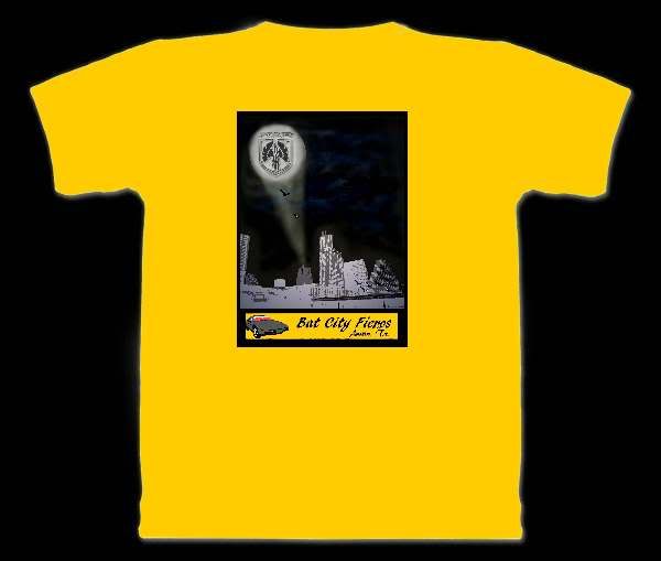
I was thinking the same thing about the shirt pocket. Have the big logo on the back and the Bat Fiero symbol on the front. Someone needs to look into getting hats made with them on there. Hmmm, I bet Mike could but the symbol on one of his custom cup holder.......
IP: Logged
09:32 AM
Tom Slick Member
Posts: 4342 From: Alvarado, TX Registered: May 2003
just one small critque. i think when you make the shirts, the red in the banner and the red in the flag may blend together. might want to change the red in the background to another color. IMHO...
had t go with new texts.... the old one didn't show up well on the yellow.
text 1:
text 1 : with peel out...
text 2:
I don't think moving the text area topwise would work... since that'd distract from the beams fiero logo. if I get time later I'll do it for grins though.
[This message has been edited by boomme (edited 06-21-2011).]
IP: Logged
02:52 PM
Marine1981 Member
Posts: 1364 From: Austin, Texas, USA Registered: Jan 2011
ARGGGGG please fill in the white spoches on the hood and bumper
1 with or without the burn out is ok by me.
Just let me know when you want to send it to the members for their answer! Maybe two really good ones so they can pick and choose. OR offer maybe more feedback on the design.
IP: Logged
09:10 AM
Cheever3000 Member
Posts: 12400 From: The Man from Tallahassee Registered: Aug 2001
Originally posted by Flamberge: I'm the one that made the batwing Fiero logo. I'll boost the size and resolution when I get home tonight and send it out to everyone.
I might also make myself a tshirt on Cafepress with it just to see how it would look.
Patrick, If you do send out the bat logo, go ahead and send out the two or three layout designs and include a link to this thread for the non PFF folks.
OR just send it all to me and I will take care of it.
Sounds like someone wants a shirt real bad
IP: Logged
08:41 AM
Marine1981 Member
Posts: 1364 From: Austin, Texas, USA Registered: Jan 2011
Patrick, If you do send out the bat logo, go ahead and send out the two or three layout designs and include a link to this thread for the non PFF folks.
OR just send it all to me and I will take care of it.
Sounds like someone wants a shirt real bad
Email sent.
IP: Logged
08:54 PM
Flamberge Member
Posts: 4268 From: Terra Sancta, TX Registered: Oct 2001
yeah... a thought... If we go black shirts... because the border fades into the black - I'll need to make the yellow block larger to match the picture width above it.
[This message has been edited by boomme (edited 06-23-2011).]
IP: Logged
10:10 PM
Dehning Member
Posts: 22 From: Austin, TX, USA Registered: Feb 2011


 )
)