I am 58 years old an have to wear glasses. But some of these colors, are causing me real problems in reading. I cannot read the blues at all. I have tryed to make changes in the monitor settings. 256 colors make it so I can some what read the blue. Not trying to complain, but having a real problem reading the posts with some of the colors. It's Hell to get old, but I am trying to stay young by hanging with the Fiero Forum. You do what you want it's your site, I could read the other color scheme easier. Just an old fart.
First off, let me apologize for the way I came across in my now closed thread. I posted in a panic, and was knocked off-guard by changes that make the forum almost impossible for *me* to read. I don't consider it an honor to have a thread of mine closed, and I'm ashamed.
Ok, I came back today to see, maybe, if it was easier for *me* to read this on my 17" monitor. In my honest opinion, it is very, very difficult to read.
Since Cliff has mandatory style sheets or whatever it is that controls the display of PFF's features, I cannot make any adjustments to make this easier to read. So, let me describe what I'm seeing:
The text in this box is, as measured on my screen, 3 millimeters tall. This is very small, and I cannot easily or comfortably read this small of a font from my normal eye to monitor distance of approximately 76cm. Also, since this font is "thin" it seems that the "strokes" of each letter are only one or two pixels wide, so that causes them to blur. Combined with the black background, bits and pieces of the letters seem to disappear against the very dark background of this text box, especially when scrolling back and forth to make edits.
As a result, I have to squint and move my face closer to my monitor to see what I'm typing, and the squinting in combination with the contrast with the bright white scrollbar at the bottom as my eyes move back and forth while typing is making my eyes tear up right now.
Also, the afterimages of the white bar and the white text are creating distracting black bars in my field of vision that make it incredible difficult for me to focus on the screen for more than a minute at a time.
Next issure: The dark font colors against the even darker background colors has lowered the contrast ratio on the remaining parts of the message list pages. For instance, I cannot even see the number to the right of "Total Ratings" unless I highlight it with a mouse click/drag. The dark blue text is invisible against the dark blue background. When I move my mouse curser over a hotlink the medium orange text turns a dark orange that is just as dark as the dark blue background, and for all intents and purposes I cannot see the link text anymore. When I move my mouse cursor over the text in this composition box the cursor takes the form of a capital letter i, but it is black, and against the almost black background of the box I cannot see it at all. I have to randomly click and drag to highlight text to get an idea where the cursor is, but even that is difficult since the higlighted text becomes dark blue and is invisible against the black background of this box.
On the topic list page for the various forums the "views" text is a dark grey, and the background is a sort of a medium to dark blue. This makes the text seem to fade in and out of existance to my eyes. Followed links to the topics are a dark orange which is almost invisible against the dark blue of the background. Luckily I can read them by putting my mouse cursor over them to turn them yellow, which operates backwards from some of the other orange links which turn dark orange when mousovered.
On the topic lists with multiple pages, the followed page numbers are dark, dark grey, and fade into the dark blue background
All of this is made worse by the bright, light grey and white of my brouser's scrollbars and the toolbar across the top, which adds even more of the dark afterimage bars in my eyes. I just looked at the wall behind my monitor and my vision is extremely cluttered with these dark bars.
Now, factors that I might try changing: I can't change the appearance of the site because of the mandatory style sheets, but maybe I can drop the resolution of my monitor down to 640x480? Maybe that would force a bigger, more solid text font. Normally I do my computer work with the lights very dim in this room, maybe I can turn the lights up to full brightness? I don't want to turn my monitor brightness up any more because it's already hurting my eyes and making them tear up as it is.
Ouch! Just discovered that when I alt+tab to ACDSee or Paint Shop Pro, both of which I keep open to do picture work for the forum, the light colors really blast my eyes after they adjust to the darkness of PFF. I'll have to let my eyes adjust by looking at my light before switching to those apps.
I don't know what to do, Cliff, I really don't. I really appreciate your hard work, and never meant to slight that in any way.
JazzMan
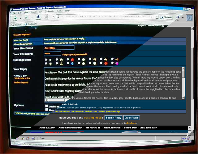
Forgot to add, FWIW, here's a screen shot of what I see: The colors and stuff are brighter because the camera auto-irised.
[This message has been edited by JazzMan (edited 01-15-2004).]
IP: Logged
01:04 AM
Oreif Member
Posts: 16460 From: Schaumburg, IL Registered: Jan 2000
Not sure how everyones computers are set up, But on my main home computer the forum was really, really dark. But at work and the 2nd computer it was great! So I was playing around and found that if you right click on your desktop, Select "properties" then "settings" , "advanced" then see if you have a "color correction" tab. I turned the contrast down, The gamma down, and the digital vibrance to mid and now the forum looks great on my main computer! You can move the gamma around and get it even lighter if you want.
Just thought this would be helpful if you think the forum is too dark.
Jazzman, That's how dark mine looked until I did the above. Hope it works on yours as well as it worked on mine. Mine was so dark I could not see the "IP Logged" in the bottom right corner of each post, Now I can and the colors are not so contrasting. The blue ratings number is even readable now.
[This message has been edited by Oreif (edited 01-15-2004).]
I have built several sites in the past and I always start with a Black background. I just like the darker looks of sites since they don't Blast your eyes as bad. I've been reading all of this and don't have a headache at all. I like the new layout and may have some constructive tips that may help some of the oulder eyes as well. It seems to me the text in the left column is brighter than the text in the message screen. Is this correct? Maybe it's the pureness of the colors. Let me try a few things here they may work or may not.
TEST 12345676890 test waersdtyuionjoredygtu
TEST 12345676890 test waersdtyuionjoredygtu
TEST 12345676890 test waersdtyuionjoredygtu
TEST 12345676890 test waersdtyuionjoredygtu [size=18]TEST 12345676890 test waersdtyuionjoredygtu[/size]
Let's see how this turned out.
Double post to test both background colors
[This message has been edited by stuartlowery (edited 01-15-2004).]
IP: Logged
01:30 AM
BobadooFunk Member
Posts: 5436 From: Pittsburgh PA Registered: Jun 2003
hey i can read the new format fine *EXCEPT* the quotes are all in white infront of the tan quote box, cant read a thing in quote boxes! other than that WONDERFUL!
Orief, I tried what you suggested on the monitor settings. It helped a little, but not enough. Even worse, it completely screwed up the video setup I did for watching DVDs. The problem for me is that the colors are either too contrasty or not enough. Oh, and when I submit a PM and the forwarding message page comes up it's the old bright white color and with my pupils dialated to the dark screen that white blows me away. I have to close my eyes now when I hit submit so that I don't get blinded.
JazzMan
IP: Logged
02:33 AM
AusFiero Member
Posts: 11513 From: Dapto NSW Australia Registered: Feb 2001
Forgot to add, FWIW, here's a screen shot of what I see: The colors and stuff are brighter because the camera auto-irised.
That isn't even close to what it should like. Either your monitor is seriously off, or you have your colors set to 16-bit or less, or Netscape 6 is displaying the page incorrectly.
First make sure your colors are set to display 32-bit. Next, try opening the page in IE and see if there's any difference.
So far, everybody who has been complaining about the colors had either a faulty monitor, or had their desktop settings completely wrong.
IP: Logged
07:16 AM
Cliff Pennock Administrator
Posts: 11899 From: Zandvoort, The Netherlands Registered: Jan 99
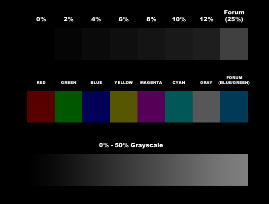
Here's how your screen looks (left) and how it should be (right):
If, looking at this image, there isn't a huge different between the two, then your monitor is way off. If you do see a big difference, but your image looks more like the one on the left, then either your desktop settings are incorrect, or your browser is messing up things.
IP: Logged
07:31 AM
Cliff Pennock Administrator
Posts: 11899 From: Zandvoort, The Netherlands Registered: Jan 99
My monitor is calibrated. I've created a colorchart and I'll explain what you should see:
If you look at the top bar, those are grayscales with luminances ranging from 0% (black) to 12%. If your monitor is correctly calibrated, 0% to 4% should be the same as the background (black), 6% should be barely distinguishable from the background (only if you look really, really close in a dark room), 8% should be distinguishable, and 10% should be easily distinguishable (even in daylight). For comparison, the most right box is the forum's background color (25% luminance).
The second bar displays different base colors with the same luminance as the message background. They should be very easily distinguishable from the background. You should also be able to easily see the difference in colors. For comparison, the most right box is the forum's message background.
The third bar is a grayscale gradient from 0% luminance to 50% luminance. It should be smooth with no pixelation (dithering) and you shouldn't see any blocks. Also, you should start to see the bar below the green box above it.
On a LCD monitor, the colors are probably a little bit brighter.
If the top bar looks black to you, or if you can hardly make out the colors in the middle bar, or you start seeing the bottom bar far more to the right than I explained, your monitor is off.
If the forum's background isn't the same as the top right grayscale box, or if the message background (the darker of the two) isn't the same as the most right box from the middle bar, then your browser is messing up the colors.
Sorry to beat a dead issue but at 51 years old I must use my co-workers reading glasses to read this forum now, with some lines of text so dark I don't even see them unless I highlight them.sorry Cliff
ok, my monitor is old and so are my eyes, but today it looks a lot better than yesterday. personally, i'm a blue and green kind of guy, and i dont care for all the dark colors, but i can read the forum without getting eyestrain, so i'm happy. thanks.
now, who wants to buy me a new monitor so i can see the forum in all its glory? i'd like a 17" (or bigger) LCD, please.
IP: Logged
06:28 PM
buddycraigg Member
Posts: 13620 From: kansas city, mo Registered: Jul 2002
that is exactly the difference between my work computer and my home computer. i looked at a color bar on the web from work and i have all of the colors.
at first i though that maybe the web blocker at the dealership was somehow blocking some of the stuff on the pages. so i dialed in to remote control my computer at home, brought up PFF and it stilled looked the same, the window of what my computer (which i know looks ok) looked just as bad as the acutal IE window of PFF at work.
that proved to me that it must have something to do with the monitor. but i still haven't figured it out yet. EDIT PS, that would also make me think that jazz may not be able to see the color difference in that pic. i'm intersted to look at that pic at from work. Now i wonder if it's a problem with the IE 5.5 at work? if that pic looks ok at work then that would almost have to be it. (but i know my monitor is still a little dark)
[This message has been edited by buddycraigg (edited 01-15-2004).]
Ok, I messed with my monitor today, and my video settings. It is now much more useable than it was yesterday and the day before. The calibration pictures posted by Cliff now match mostly what he described for the most part. There are still some small problems, like some mouseovered links change to the same intensity as the background and therefor become invisible to me, but I can work around that. The light text on dark background in the text composition windown is still difficult to see for me, but now that it's a mild white on grey it's not as painful. I'm still having problems with the dark afterimages, but I guess I'll get used to that in time.
I'm not going to say that I'm totally happy with this, that would be lying and I just don't do that, but I will be able to work with it.
Go to a place helps (partially) blind people read computer screens or TV's or projection screens. It will ALL be white on black.
I don't care if you dont listen to me but it IS easier on your eyes!
And by the way, where did i say i was an expert? I didnt. it was my opinion and what i had experienced through professional work. Do I laugh openly at your opinions and experiences? Nope. I'd appreciate the same. Thanks.
Cliff - The new design uses GREAT colors. A bit of constructive criticism would be to make the header bar extend a little farther (it overlaps on my 1600x1200 screen )
IP: Logged
09:25 PM
PFF
System Bot
Archie Member
Posts: 9436 From: Las Vegas, NV Registered: Dec 1999
...In older threads like this one...... The quoted text has the same color as the background. I noticed it on the PC at the shop and waited to come home and check it on my new PC.
Ditton. Saw it today at work, and just got back home. You can read it if you highlight it, so the text is there, just white on white.
Well just got home from a trip to Madison, and LOVE the new look! Much easier to read in the late hours of the eve when I'm usually here!
The only funny thing for me is the new buttons (put in a while back, before the color change) disappear when I mouse over them, then re-appear in a few seconds.
I imagine its much faster for someone in civilization with a real connection!
Hey Cliff I have a forum that allows multiple styles to be added to the board. I curently have 4 different color and layout styles that the users can choose from in their profile. While I admit it's a PHPBB setup, is there anyway to EASILY incorporate that into this system? I will say that to color blind people that reds and blues no matter the shades will blend together and this may be causing some of the problems. I will say I love the new scheme and I'll admit I even tried to copy the colors, even crashed my board trying. That was a fun one to get going again.
BTW what system is this board?
IP: Logged
04:07 AM
Cliff Pennock Administrator
Posts: 11899 From: Zandvoort, The Netherlands Registered: Jan 99
Now i wonder if it's a problem with the IE 5.5 at work? if that pic looks ok at work then that would almost have to be it. (but i know my monitor is still a little dark)
OK ALTHOUGH still dark, i can see the pic correctly, i guess i'll find IE6 an install it.
Go to a place helps (partially) blind people read computer screens or TV's or projection screens. It will ALL be white on black.
I don't care if you dont listen to me but it IS easier on your eyes!
And by the way, where did i say i was an expert? I didnt. it was my opinion and what i had experienced through professional work. Do I laugh openly at your opinions and experiences? Nope. I'd appreciate the same. Thanks.
Cliff - The new design uses GREAT colors. A bit of constructive criticism would be to make the header bar extend a little farther (it overlaps on my 1600x1200 screen )
You missunderstood mt point. Which was: Actual people here, ON THE FORUM, were saying that the white on black WAS harder to read. Your post was a bit paumpus i think, because it infered that the people that were having a hard time with it were liars or something, when clearly your "proven fact" that it is easier was being contradicted. /shrug
OK, I don't know what is up with some of the ppl on here today but it's been a proven fact many times over that light colors on dark backgrounds are EASIER on the eyes than dark on white...
case and point dude. i was not laughing at your opinion, because this isnt one. its you rideculing people
I wonder how many people know just how hard it is to do this and keep from crashing the site. But I have noticed that white text looks a little bolder than the color currently used
RETYPED IN WHITE
Cliff,
I wonder how many people know just how hard it is to do this and keep from crashing the site. But I have noticed that white text looks a little bolder than the color currently used
For what it's worth, the greyish text is MUCH easier for me to read than the white. The few changes that have been made in the last few days have helped a lot. With exception to the funky quotes in old threads, I don't have any issues now. I like the style update a lot, it looks much more current. I didn't mind the old style though, being trendy is a pain in the ass...just look how long it's taken Cliff to implement a new look. That's why I wear jeans and t-shirts, it works and it's easy.
Bryce 88 GT
IP: Logged
02:24 PM
Jan 17th, 2004
buddycraigg Member
Posts: 13620 From: kansas city, mo Registered: Jul 2002
Your ratings number goes white once you get a new vote. It's blue if no one has rated you since the new system went into effect. (I just got a new rating, kwel )
IP: Logged
01:37 AM
DotTC Member
Posts: 2345 From: Hamlet, North Carolina Registered: Nov 2003
Your ratings number goes white once you get a new vote. It's blue if no one has rated you since the new system went into effect. (I just got a new rating, kwel )
Cliff is awesome ppl have to be patient and stop b!tching so much. of course that is one way to get another rating.. hehe
------------------ "As we live on, we lose a little bit more. Shrouded in falsehoods and lies, we stand frozen to the spot, unable to cry out" - Deep Forest
I deal with this kind of crap at work all day. Points to you Cliff for takeing a bold approach. The problem with doing that is always that some people won't like it. I have to admit though, I thought it was pretty cool when I first saw it and went looking for a post in the announcements section. I was surprised not to see some comment there.
A couple of things... First, I don't think the new color scheme works well with the old color highlighting thing in the Mall. Sorry, I don't have any good suggestions for new highlight colors.
People that have a problem with the font size should be allowed to adjust the font size using their browsers. It looks like you can't using Internet Explorer. As a side note, you can adjust the font if you use a Mozilla/Netscape based browser. Get yours for free here. http://www.mozilla.org/
One of the things I have to deal with, writing code for commercial distribution is dealing with the accessability issue. The W3C has a lot to say about it. http://www.w3.org/TR/WAI-WEBCONTENT/ They are at least nice about it. The US gov. isn't. There is a really cryptic document that describes what you have to do about accessibility to sell to them. Two minimum things that you're not doing very well right now, are allowing people to adjust font sizes using their browsers and to adjust to their own ugly colors if they feel it helps them be able to read the text.
While I like what you've done with the place, others seem to be haveing some problems. Some amount of accomodation might be a good thing. The software I spend my day writeing code for allows a user to specify in their preferences the choice of a couple of color schemes. Maybe something similar might work for PFF? I would be happy to help, for free and no recognition.
I have a buddy that's completely blind (lost it as an adult to diabetes). He makes a living selling computers that he has assembled, on ebay. He has the windows install memorized up to the point where the sound card starts working. It's an amazeing thing to watch him navigate eBay with a program that reads the text to him off the screen. He has it set so fast I can't understand it. It makes you want to get all of your alt tags right, and watch your sugar levels.
- Daniel
IP: Logged
02:49 AM
Capt Fiero Member
Posts: 7658 From: British Columbia, Canada Registered: Feb 2000
Personally it is going to take some time to get used to but I like. I also like change in general and it makes me happy just to have it diffrent. I admit it is a bit harsher on da eyes and I am only 28 but I am also partily tipsy from the bar, am very tired and sitting in a totally dark room with only the moniter on in front of me and beside me.
Props to Cliff for doing Awesome Work.
(now if I could only learn PHP for my computer message board and make it look 1/2 this good)
------------------ 85GT 2.9 4spd MSD Everything, Big Cam, No Cat and Nitrous. Nawzz babeee!!!! http://www.captfiero.com


 ,
,