Here is an easy way to change text to black on white background if you are having trouble reading it. Just drag and highlight the text. Presto you got black text on white background no matter what the colors are.
IP: Logged
08:45 AM
blackrams Member
Posts: 33302 From: Covington, TN, USA Registered: Feb 2003
I'm not sure of the reason for the change, and I'm not saying change is bad, but in this particular case, there seems to be quite a few folks to include myself that are now having a hard time reading the Forum. If the Forum is truely for all Fiero enthusists, then I would suggest that this change is not necessarily an improvement and if this were a democratic forum, I believe the majority would vote to go back to the orginal color scheme, not because this one isn't cool, but because the change now makes it more difficult to use. Just my 2 cents worth.
------------------ Ron 88 Formula, 4.9, auto, daily driver 88 Formula, 3800 SCII/4T65E Swap in Process, almost done. 88 Formula, 5 Spd, 3.4 TDC Swap in Process, just started. 88 Formula, Stock, 5 Spd, T Top, Special Days Only!
[This message has been edited by blackrams (edited 01-14-2004).]
IP: Logged
09:44 AM
CoolBlue87GT Member
Posts: 8542 From: Punta Gorda, Florida, USA Registered: Apr 2001
Took awile to get used to the new look. Yesterday I dropped in at work, I thought the there was something was wrong with the computer !!! lol
I checked it out again this morning, at home, the litttle changes you made through out the day has made the look a bit easier on my eye's. I use a new laptop , 17" screen. I miss the old look, but am getting used the the new look
Reading the posts are oaky, the brighter white used in the posting screen could be toned down a bit. That is harder on the eyes. I think I read where you were going to change that.
Thanks for all your hard work, I know it's hard to accept the complants. I work retail all day, the crap I put up with is a pain.
Happy Anniversary !
[This message has been edited by CoolBlue87GT (edited 01-14-2004).]
Hey Cliff, Thanks for the new look! I like it a lot! Thanks for all your hard work! The only suggestion I have is the "rate this member" and the total ratings number on the left. The bright blue is hard to read. Maybe lighten it up a little like the blue on the question mark icon?
------------------ Happiness isn't around the corner... Happiness IS the corner.
Hey cliff the subtle changes you made overnight really bring out the new look while making it easy on the eyes. I just noticed the grey text boxes for replying. Don't bother changing it anymore, it looks great now. I'm not positive but it looks like you made the text in the posts a slightly darker color instead of bright white. It looked good in white but now its perfect. Maybe its just the monitor I'm on but it looks different then it was last night. Awesome!
Can you confirm what changes were made?
Oh and to the guy who said that "if the forum was democratic most people would vote to have it changed back", you obviously didn't do well in math class. Its plain as day that well over 90% of the people who commented here were in favor of the change. I think you hold your opinion above others and must have counted it a few dozen times.
Then somebody comes along and says something along the lines of "well, the new colors are giving me a headache, so I will no longer visit the forum. Bye all, it's been nice knowing you". Yes, I think that's indredibly rude. Especially when all during this thread I've been making changes so as many people as possible feel comfortable with the new scheme. It would have been a whole different story if he said something like: "Cliff, the new colors are giving me a headache, is it possible you change it a bit?". But, since everyone is entitled to his own opinion, I answer with: "you leave the forum over colors? Now I've seen it all". Even added a smiley, hoping people would understand the reference I'm making to a few other threads where we discussed why some people left the forum.
I am dissapointed Cliff that you thought my saying I had to leave the Furum war rude. I did not think of it that way. I thought i was being gratious enough to bow out on something that everyone else seemed to think so highly of. Perhaps it was a bit premature to say that, but i also mentioned that perhaps my eyes would adjust over time, but after reading for a while it did not appear to be doing that.
As for not saying "Cliff, the new colors are giving me a headache, is it possible you change it a bit?". I am of the believe that the needs of the many outweigh the needs of the few. Therefore i thought i would sound like a jewish princess if i were to say "gee, i know everyone else loves the changes, but would you make this particular change for just lil ol me?" So i did what i thought was the least selfish thing and apparently it did not go over with you very well.
I appologize and was not in any way complainging about the hard work you did, or thought that it did not look good. In fact, my wife who was watching TV behind me when i first logged on yesterday heard me say "Wow, Bada$$!" she says "what?" and i say "Pennocks got a new make-over, check it out" And i still think it looks great! i just get a headache if i read it for more than about 20 minutes or so. As i said before i am wearing sunglases that helps quite a bit.
I believed at first when i saw it, and i believe now; it looks great, Dont change a thing if the majority likes it
Take off the sunglasses and try again. The colors are more subtle today. Its quite nice actually.
IP: Logged
11:25 AM
FLASHY Member
Posts: 1079 From: Calgary, Alberta, Canada Registered: Feb 2001
You haven't been around long enough to make that statement, my friend. The site actually has been shut down before! I think it lasted a day or so, can't remember the specifics.
Bryce 88 GT
I've been around longer than you Just not under this username. I remember the site being shut down, I also remember hearing Cliff himsefl say that he wouldn't shut the site down over a few inane ppl
------------------ "As we live on, we lose a little bit more. Shrouded in falsehoods and lies, we stand frozen to the spot, unable to cry out" - Deep Forest
IP: Logged
12:49 PM
The Fieromaster Member
Posts: 4124 From: Painesville, Ohio USA Registered: Jun 2001
I've been around longer than you Just not under this username. I remember the site being shut down, I also remember hearing Cliff himsefl say that he wouldn't shut the site down over a few inane ppl
Been around since 8-14-00 (Fieromaster) dont remember the shut down?!?! Perhaps it was during my hiatus? BUT STILL... disrespect is disrespect. I wont repeat anything i said on Page 4... it was VULGAR and i shouldnt have to..
IP: Logged
01:00 PM
buddycraigg Member
Posts: 13620 From: kansas city, mo Registered: Jul 2002
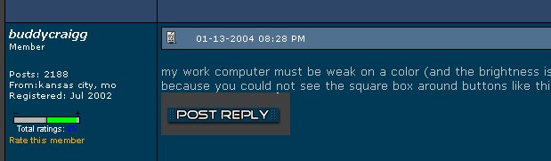
my work computer must be weak on a color (and the brightness is up all the way) because you could not see the square box around buttons like this one...
Yep, I defiantly have a problem with my work computer. This is what I see in this partial screen grab I did at work.
The entire back ground is black. All of the text on the left side (user info) is white Rate this member is orange. Total ratings number is a blue speck and is unreadable. There is a dark blue bar separating each post with white text And the actual text of the post is in a medium gray
[This message has been edited by buddycraigg (edited 01-14-2004).]
IP: Logged
01:07 PM
stimpy Member
Posts: 8197 From: Salinas, CA Registered: Jan 2000
I personally would request, Cliff, that you have the common decency to change all coloring and format to that of the corporate intranet here at my work. That would make it far easier to pretend like I am working. After all, this site is here for my amusement only.
I eagerly await your compliance.
IP: Logged
01:28 PM
buddycraigg Member
Posts: 13620 From: kansas city, mo Registered: Jul 2002
I personally would request, Cliff, that you have the common decency to change all coloring and format to that of the corporate intranet here at my work. That would make it far easier to pretend like I am working. After all, this site is here for my amusement only.
I eagerly await your compliance.
LMAO!!!
IP: Logged
01:44 PM
buddycraigg Member
Posts: 13620 From: kansas city, mo Registered: Jul 2002
......... there seems to be quite a few folks to include myself that are now having a hard time reading..............if this were a democratic forum, I believe the majority would vote to go back to the orginal color scheme.............
Quite a few is a hell of a lot less than a majority. If you have been reading, most of the people that are posting are in favor of the new colors. As Cliff has mentioned, he still needs to finish up some of the details, and if you have some input, by all means speak up and offer a way to assist......not just trash the new format. You don't like it? Fine. You are entitled to your opinion. But to suggest that the majority would vote to return to the original colors is assinine. Deal with it. You are old enough to deal with a little adversity in your life, and if this is sooooo bad as to cause you hardship, your life sucks. Help....don't hinder.
Mark
IP: Logged
02:19 PM
Fformula88 Member
Posts: 7891 From: Buffalo, NY Registered: Mar 2000
Cliff has eyes like the rest of us. Hard to believe, I know. Since he does have them, he can certainly tell what is easy to read and what is hard to read. I am sure he will get everything straightened out! In fact, I think he has cleared up most of the hard to read items. There are still a couple, like the number of times everyone has been rated, but nothing that is too big of a deal. The new look is great! Most like it, and I think those who are not crazy about it initially will adjust and won't mind it after a short while. Keep up the great work on the forum Cliff!!
IP: Logged
02:40 PM
AndyLPhoto Member
Posts: 2420 From: Skandia, MI, USA Registered: Nov 2001
Love the new format. I haven't been doing as much reading here for the last couple weeks for work-related reasons, but when I've been here, I think the new colors are great.
Anyway, just wanted to throw in my $.02 here. Looks great on the LCD display at work, and on my CRT iMac at home! Here's one I don't recall seeing before. My eyes got nice and used to the darker colors (I think it's easier to read that way.) The quote boxes are nice, but the message box when posting/editing a message is really bright! Of course, this is less of a problem for some of us than others! Keep up the great work Cliff!
edit: I just posted (wow...brilliant, huh?) and was delighted to see that I was taken back to page 5, where my post actually appeared, rather than to page 1. Thank you!!! I love it.
[This message has been edited by AndyLPhoto (edited 01-14-2004).]
IP: Logged
02:47 PM
FieroGTguy Member
Posts: 3087 From: Indianapolis , IN Registered: Mar 2001
I guess the only fair and easy way to "Let the people decide" is to take a poll on the main page (like you have done in the past. I think you'll easily find the minority vote. I just don't get why you quit over a couple rude comments when you have hundreds that encourage the change more than it has been dissed. Would it make you feel any better if you change it back, and I complain about the cool changes that were scrapped?
Just keep going, and get jiggy with it. ::waves some more paypal $$ at you to keep going::
You have created a fun place for all, and a lot of people enjoy it at your expense without giving it a second thought. Many more love what you have done, so please take more stock in us than the nay-sayers.
Thanks, Greg
IP: Logged
03:04 PM
CoolBlue87GT Member
Posts: 8542 From: Punta Gorda, Florida, USA Registered: Apr 2001
edit: I just posted and was delighted to see that I was taken back to page 5, where my post actually appeared, rather than to page 1. Thank you!!! I love it.
Cliff,
I notiiced if you edit a post a second time, it returns you to the first page. ( just FYI )
IP: Logged
03:50 PM
Rodrv6 Member
Posts: 1910 From: Ball Ground, Ga. Registered: Nov 1999
Personally, I LOVE the new look!! Yes, there will be some that don't like it and may fuss, but there is no way you're going to please everyone. Come to think of it, the world would be pretty boring if we all liked exactly the same thing Everyone needs to keep in mind that Cliff is constantly tweeking things here on the Forum and nicely worded CONSTRUCTIVE criticism is much more effective than just saying "I think this stinks" or some such. I really appreciate his efforts to keep this wonderful resource up and running despite having to put up with a very small minority who feel like they are the only ones in the world that matter. Cliff, you're doing a GREAT job!!!!!!!
------------------ Rod Schneider, Woodstock, Ga. White 88 GT
IP: Logged
04:13 PM
Voytek Member
Posts: 1924 From: Calgary, Alberta, Canada Registered: Jan 2001
Its called C-H-A-N-G-E folks. It happens everday in life. Ever try to find an item in Wal-Mart for the 2nd trip around? Ever turn on the TV to findout channel 6 is now channel 97?
In a few weeks, everyone will be OK. You'll be so used to the "new", you'll have forgotten about all these changes.
I'm not sure of the reason for the change, and I'm not saying change is bad, but in this particular case, there seems to be quite a few folks to include myself that are now having a hard time reading the Forum. If the Forum is truely for all Fiero enthusists, then I would suggest that this change is not necessarily an improvement and if this were a democratic forum, I believe the majority would vote to go back to the orginal color scheme, not because this one isn't cool, but because the change now makes it more difficult to use. Just my 2 cents worth.
IP: Logged
05:22 PM
PFF
System Bot
AusFiero Member
Posts: 11513 From: Dapto NSW Australia Registered: Feb 2001
Looks to me like the text color has been changed in the message post box. This change has made it easier for my eyes to read. The text in the post box is still white and I can really tell the differents. So, I vote for the change in general, and the text color change in particular.
Was this an upgrade, a tweek, or totally different software.
Again THANKS for YOUR time, effort, energy! This forum gets better as it goes!
IP: Logged
07:46 PM
buddycraigg Member
Posts: 13620 From: kansas city, mo Registered: Jul 2002
hey... those are yellow letters so that's what it's suppose to look like. that's it. i'm grounding the anadoe to the coil tomorrow night after everyone leaves and making the computer fix it guy get me a new one.
IP: Logged
07:53 PM
Raydar Member
Posts: 41623 From: Carrollton GA. Out in the... country. Registered: Oct 1999
I have noticed quite a few tweaks, since the first change. And for some reason it seems to look better at home than it does at work. Both monitors are Dell Trinitron.
Lookin' good.
Thanks, Cliff!
------------------ Raydar 88 3.4 coupe. Coming soon... 88 Formula, presently under the knife.
IP: Logged
09:48 PM
DjDraggin Member
Posts: 2854 From: St Louis, MO. USA Registered: Feb 2003
Just a heads up Cliff.. In case you didn't know,.. the Search is still under the old design, along with FAQ. So those that like the old design you better hurry up before all remnants are all gone and are in the past.. HEHEHE Looking better each day bud !
Lots of great improvements going on including the fast server.
The new color scheme is difficult for me to read, maybe after Cliff does a couple of tweeks here and there I wont get the headaches after 30 minutes. It is like it takes alot of effort to read the type but I will stick with it. I do however say "Kudos" to Cliff for working so hard for us here.
Someone mentioned buying a new monitor. How or why would that help? I could surf the forum all day while pretending to be sick from work, no problem, so could someone explain exactly the reasoning behind it please? Perhaps there might be a common denominator of some sort in the monitors that is causing the complaints?
Please dont get too discouraged Cliff, change is sometimes difficult for us too. tm
------------------ jetman Silver 86 SE 2M6 4-speed, with "check wallet light"


 I wont repeat anything i said on Page 4... it was VULGAR and i shouldnt have to..