Looks like there is going to be not only a color change here on the board, but Im going to have to change the "standard color" that I use to post, as green is now VERY hard to see...
There "she" be....
Lets all welcome the new format, which like the knife edge styling of the new "Caddies" will grow on ya!
[This message has been edited by mcaanda (edited 01-13-2004).]
IP: Logged
11:18 AM
Cliff Pennock Administrator
Posts: 11899 From: Zandvoort, The Netherlands Registered: Jan 99
Man This Is So Sweet ..Me Likey The New Color Format!!!!!!!!!!!
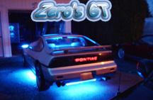
------------------ Zero C's 86 Gt Fastback "This car is so good looking its almost indecent. - AutoWeek on the new 1986 GT" Vin Number: 1G2PG9793GP249577 Many Mods Zeros Home Page MSN Messanger tylercaddick@hotmail.com
IP: Logged
11:23 AM
LoW_KeY Member
Posts: 8081 From: Hastings, MI Registered: Oct 2001
ooooh all we need are more smilies wow I was wondering if I came to the right site at first.. thought I went to another board, this kicks butt in my mind! I like it!
Cliff, Forum looks awesome. I was very surprised when I logged in, but at least it dosen't look like I am the only one.
One artistic thing that is butting me though is in the header. Your Pennocks Fiero Forum logo, looks bit stuck ontop of the new banner. Point I am trying to get across is this, you obviously spent time creating the header and makeing it look stylish and very blended. And then there is the Pennocks logo looking very flat and pased ontop of the formentioned banner. Personally I would like to see something done to blend it in a bit and maybe bring it up to make and make it look a bit more 3D.
* the above is just my opinion, it is not meant to portray any ill toward others. *
You mean like this? (might need to hit Refresh before you see the change)
That looks much better
And the new color scheme rules!! (Although it did really confuse me for a minute when I got up this morning a little after six and was nice and tired and came to check out the forum and saw this....now that was an interesting way to wake up )
[EDIT] To remove sig [/EDIT]
[This message has been edited by naskie18 (edited 01-13-2004).]
IP: Logged
11:55 AM
PFF
System Bot
naskie18 Member
Posts: 6258 From: Commerce Twp, MI, USA Registered: Jun 2002
Cliff, Forum looks awesome. I was very surprised when I logged in, but at least it dosen't look like I am the only one.
One artistic thing that is butting me though is in the header. Your Pennocks Fiero Forum logo, looks bit stuck ontop of the new banner. Point I am trying to get across is this, you obviously spent time creating the header and makeing it look stylish and very blended. And then there is the Pennocks logo looking very flat and pased ontop of the formentioned banner. Personally I would like to see something done to blend it in a bit and maybe bring it up to make and make it look a bit more 3D.
* the above is just my opinion, it is not meant to portray any ill toward others. *
I was thinking something like this:
IP: Logged
12:03 PM
Cliff Pennock Administrator
Posts: 11899 From: Zandvoort, The Netherlands Registered: Jan 99
Just got my cable modem hooked up this morning and imagine my surprise when the first place I go looks so totally different! I just thought to myself - what have they done? Anyway, I really like it -- way to go Cliff
Mike
IP: Logged
12:07 PM
Czechfiero Member
Posts: 166 From: Zlin, Czech Republic, EU Registered: Jul 2003
The new color scheme looks really good! It definately gives the forum a more modern look. Can the light blue in the quote boxes be toned down a bit? They seem to be really bright off the dark background. Also, for threads with multiple page numbers, its almost impossible to read the page numbers. Both the blue before its clicked on, and the pink after are very hard to read. Can they be brightened up? Sorry for the nit-picks, overall I think its great!!
Ouch! I think I just hurt my eyes while jumping to the good ol' search page - Being able to compare the two side-by-side I definitely find that I prefer the the darker color scheme!
IP: Logged
12:48 PM
GTFiero1 Member
Posts: 6508 From: Camden County NJ Registered: Sep 2001
this change was deffinatly needed, I am a member of many forums and this is a great changge much easyier ont he eyes and a real pleasure over all. Good deal!!!!!!!!!
IP: Logged
01:19 PM
jscott1 Member
Posts: 21676 From: Houston, TX , USA Registered: Dec 2001
You mean like this? (might need to hit Refresh before you see the change)
Okay the dark backgrounds are refreshing and kind of easy on the eyes, but the blue letters on blue background are all but invisible on my laptop. Its a high resolution monitor with millions of colors so it's not the monitor. Not complaining, but I would suggest changing the blue letters to either white or black.
Gotta chime in here myself. I like the idea of change, but man, it's kinda hard on the eyes. I'm only 28, but ARGHH.. especially the mall listings. The small orange print is a bear. (I'm on LCD monitor) I mean, it does look a lot cooler, but if you go to an older section of the forum, it's a bit easier to skim through listing with the other color scheme. Again, I'll admit it's a lot cooler looking now, but also harder to sit and read for hours without getting a headache.(Guess I'll end up getting more work done, though. I wear contacts. Every time I blink, the text wiggles and takes a second to stop. WHOAAAAAAAAAAAAAA.. blinked.
IP: Logged
01:39 PM
buddycraigg Member
Posts: 13620 From: kansas city, mo Registered: Jul 2002
i guess i'm in the old croud. "rate this member" of people that i have not rated yet is too dark to see if i didn't know it was there i would miss it. i like the dark back ground, but some of the letter are too dark.
EDIT and i couldn't even see the screen where it says "something something, if you dont want to wait anymore click here"
[This message has been edited by buddycraigg (edited 01-13-2004).]
Cliff....Heck no I don't mind! It is certainly an honor! I bet I am the only one that had both of his cars in the PFF header! (GBCT in the last one). You can use my images for ANYTHING.
Joel
------------------
IP: Logged
01:52 PM
Wil Member
Posts: 42 From: Winnipeg, Manitoba Canada Registered: Oct 2003
Looks like there is going to be not only a color change here on the board, but Im going to have to change the "standard color" that I use to post, as green is now VERY hard to see...
There "she" be....
Lets all welcome the new format, which like the knife edge styling of the new "Caddies" will grow on ya!
The green was hard to read before.
------------------ "We're sorry, but the recipient you've entered does not wish to receive private/instant messages from you"
IP: Logged
02:11 PM
PFF
System Bot
webbee Member
Posts: 1149 From: Los Angeles, Ca. USA Registered: Jun 2000
I'm one of the old guys and hard to see some of the contrast of dark colors on a black background. The faded tread title, once read becomes too dark to see clearly and read.
IP: Logged
03:40 PM
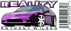
Reality Member
Posts: 1026 From: Marietta,OH,USA Registered: Nov 1999
I was sitting here looking at the screen and it dawned on me that what I was finding so cool about the new look was the awesome shading in the background. The it hit me that the shading is from the LCD screen I was trying to figure out how the screen faded from black in the upper corner to dark grey in the lower corner. I feel so dumb now.
IP: Logged
03:40 PM
My7Fieros Member
Posts: 3357 From: Germantown, TN Registered: Jun 2000
If you scan all the text with your mouse it is much more readable. The more I look at it and tip the monitor (it is a flat screan) the more that I am seeing test that is invisible to me.
I do think it looks way more modern, but tough to read.
IP: Logged
03:53 PM
Cliff Pennock Administrator
Posts: 11899 From: Zandvoort, The Netherlands Registered: Jan 99
I really don't see what's so hard to read (please be more specific). The orange on the dark background when you view the topic list is very clear on all my monitors here (both CRT and LCD monitors). The white on the dark background is very clear too, maybe even a bit too clear (too much contrast).
All text that is hard to read, was meant to be hard to read, i.e. it was meant to be as less obvious as possible (like the text "IP: Logged" or "This message has been edited by...").
Everything that is still blue (like the number of ratings, and the text "Thank you for posting") still needs to be changed since I wasn't able to test everything.
So again, I'm not sure what exactly is so hard to read...


 wow I was wondering if I came to the right site at first.. thought I went to another board, this kicks butt in my mind! I like it!


 REDHOTT88