Pennock's Fiero Forum
  Announcements
  Logo & Colors (Page 1)

Post New Topic  Post A Reply
Email This Page to Someone! | Printable Version

This topic is 3 pages long:  1   2   3 
Previous Page | Next Page
next newest topic | next oldest topic
Logo & Colors by Cliff Pennock
Started on: 10-18-2000 11:44 AM
Replies: 101 (53 views)
Last post by: onfire on 11-10-2000 03:49 PM
Cliff Pennock
Administrator
Posts: 11609
From: Zandvoort, The Netherlands
Registered: Jan 99


Feedback score: (2)
Leave feedback


Total ratings: 699
Rate this member

Report this Post10-18-2000 11:44 AM Click Here to See the Profile for Cliff PennockClick Here to visit Cliff Pennock's HomePageSend a Private Message to Cliff PennockEdit/Delete MessageReply w/QuoteDirect Link to This Post
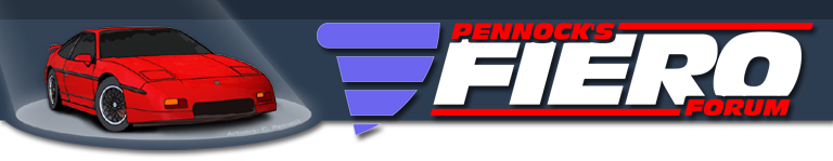
As you can see, PFF's logo has changed. This is now the official PFF-logo.

I've also been playing around with the colors of the forums a bit. I know I'm messing up some people's signature graphics with this so I need your input: Keep or loose the new colors?

IP: Logged
PFF
System Bot
Raydar
Member
Posts: 40727
From: Carrollton GA. Out in the... country.
Registered: Oct 1999


Feedback score:    (13)
Leave feedback


Total ratings: 460
Rate this member

Report this Post10-18-2000 11:48 AM Click Here to See the Profile for RaydarSend a Private Message to RaydarEdit/Delete MessageReply w/QuoteDirect Link to This Post
Works for me!

------------------
Raydar

Out of my mind.
Back in five minutes.

IP: Logged
Oreif
Member
Posts: 16460
From: Schaumburg, IL
Registered: Jan 2000


Feedback score:    (19)
Leave feedback


Total ratings: 442
Rate this member

Report this Post10-18-2000 11:49 AM Click Here to See the Profile for OreifClick Here to visit Oreif's HomePageSend a Private Message to OreifEdit/Delete MessageReply w/QuoteDirect Link to This Post
Cliff, The colors look good. Maybe lighten up the blues a shade. The darker of the blues seems a tad too dark but it looks good.

------------------

IP: Logged
Cheever2
Member
Posts: 2005
From: Tallahassee, FL
Registered: Sep 2000


Feedback score: N/A
Leave feedback

Rate this member

Report this Post10-18-2000 11:58 AM Click Here to See the Profile for Cheever2Send a Private Message to Cheever2Edit/Delete MessageReply w/QuoteDirect Link to This Post
I agree with Oreif.
IP: Logged
fiero56
Member
Posts: 4144
From:
Registered: Sep 1999


Feedback score: N/A
Leave feedback

Rate this member

Report this Post10-18-2000 12:09 PM Click Here to See the Profile for fiero56Send a Private Message to fiero56Edit/Delete MessageReply w/QuoteDirect Link to This Post
I liked the old logo.
IP: Logged
Master_Sushi
Member
Posts: 1873
From: Oakville, ON
Registered: Apr 2000


Feedback score: N/A
Leave feedback

Rate this member

Report this Post10-18-2000 12:27 PM Click Here to See the Profile for Master_SushiSend a Private Message to Master_SushiEdit/Delete MessageReply w/QuoteDirect Link to This Post
Looks Great
IP: Logged
william_thorniii
Member
Posts: 1216
From:
Registered: Aug 99


Feedback score: N/A
Leave feedback

Rate this member

Report this Post10-18-2000 12:55 PM Click Here to See the Profile for william_thorniiiSend a Private Message to william_thorniiiEdit/Delete MessageReply w/QuoteDirect Link to This Post
Cliff,

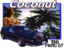
As much as I hate to agree with fiero56, I do. I liked seeing your car at the top of all the pages. The blue is fine with me. If you will recall, I really like the darker color backgrounds (from the new-years PFF theme).

Thanks for everything,

William T. Thorn, III

IP: Logged
Tigger
Member
Posts: 4368
From: Flint, MI USA
Registered: Sep 2000


Feedback score: N/A
Leave feedback


Total ratings: 71
Rate this member

Report this Post10-18-2000 01:05 PM Click Here to See the Profile for TiggerSend a Private Message to TiggerEdit/Delete MessageReply w/QuoteDirect Link to This Post
Cliff, I like the new look, but liked the old logo with your Fiero on it.

The dark and light blue text areas are cool, but the old white and grey doesn't stand out as much. I check the board often at work, and don't want to draw the attention to my screen. For special occasions having colors is cool.

IP: Logged
87ECO5
Member
Posts: 1633
From: Centerville
Registered: Feb 2000


Feedback score: N/A
Leave feedback

Rate this member

Report this Post10-18-2000 01:07 PM Click Here to See the Profile for 87ECO5Send a Private Message to 87ECO5Edit/Delete MessageReply w/QuoteDirect Link to This Post
I'm beginning to think f56 and wt3 were separated at birth!

Looks good to me, Cliff. In fact, I'm really happy with the occasional changes. The same thing day in and day out gets boring real fast.

IP: Logged
Cliff Pennock
Administrator
Posts: 11609
From: Zandvoort, The Netherlands
Registered: Jan 99


Feedback score: (2)
Leave feedback


Total ratings: 699
Rate this member

Report this Post10-18-2000 01:18 PM Click Here to See the Profile for Cliff PennockClick Here to visit Cliff Pennock's HomePageSend a Private Message to Cliff PennockEdit/Delete MessageReply w/QuoteDirect Link to This Post
Well, the new logo will definitely stay this way. I'll explain later why the logo has changed. I do agree I miss seeing my fiero too but perhaps I can squeeze the official Pontiac Fiero Logo or a picture of a Fiero on the page somewhere.

Now the new colors are discussable. I know it probably looks weird, but that's because you are so used to the old colors. I suggest I'll keep the new colors for a few days, then switch back to the old colors and then we can vote for new or old.

IP: Logged
LarryB
Member
Posts: 1181
From:
Registered: Mar 2000


Feedback score: N/A
Leave feedback

Rate this member

Report this Post10-18-2000 01:38 PM Click Here to See the Profile for LarryBSend a Private Message to LarryBEdit/Delete MessageReply w/QuoteDirect Link to This Post
Cliff, I find the new colors way too harsh on the eyes.
IP: Logged
PFF
System Bot
fieroparts.com
Member
Posts: 4831
From: Maine 207-934-1969
Registered: Jun 2000


Feedback score:    (57)
Leave feedback


Total ratings: 185
Rate this member

Report this Post10-18-2000 01:42 PM Click Here to See the Profile for fieroparts.comClick Here to visit fieroparts.com's HomePageSend a Private Message to fieroparts.comEdit/Delete MessageReply w/QuoteDirect Link to This Post
looks good!


works for me!

IP: Logged
blayde8
Member
Posts: 262
From: Golden Valley, MN
Registered: Jun 2000


Feedback score: N/A
Leave feedback

Rate this member

Report this Post10-18-2000 01:59 PM Click Here to See the Profile for blayde8Send a Private Message to blayde8Edit/Delete MessageReply w/QuoteDirect Link to This Post
I liked the old colors
IP: Logged
ChadMan
Member
Posts: 1639
From: Columbus, OH
Registered: Apr 99


Feedback score: N/A
Leave feedback

Rate this member

Report this Post10-18-2000 01:59 PM Click Here to See the Profile for ChadManSend a Private Message to ChadManEdit/Delete MessageReply w/QuoteDirect Link to This Post
I liked the lighter colors. With the blue background, people walking by my cubicle here at work can immediately tell I'm reading about Fieros instead of doing my job.

No opinion on the logo...the new design looks cleaner, but with the old design, I got to look at Cliff's cool GT.

IP: Logged
bHooper
Member
Posts: 4156
From: greensboro, nc
Registered: May 99


Feedback score: (1)
Leave feedback

Rate this member

Report this Post10-18-2000 02:02 PM Click Here to See the Profile for bHooperSend a Private Message to bHooperEdit/Delete MessageReply w/QuoteDirect Link to This Post
Cliff, I like the changes. However, it does seem to take a bit longer to load... at least on my slow 28.8 modem, at work.

------------------
hoop
Red '86 GT

IP: Logged
Cliff Pennock
Administrator
Posts: 11609
From: Zandvoort, The Netherlands
Registered: Jan 99


Feedback score: (2)
Leave feedback


Total ratings: 699
Rate this member

Report this Post10-18-2000 02:37 PM Click Here to See the Profile for Cliff PennockClick Here to visit Cliff Pennock's HomePageSend a Private Message to Cliff PennockEdit/Delete MessageReply w/QuoteDirect Link to This Post
bHooper, I think the longer loading is coincidence since the colors don't make any difference en the new logo is smaller in (file-)size than the new one.

About the colors: I have another idea. What i can do is give each section its own color. For instance, The TD&Q section will have the new blue colors, the GFC section the old colors and the TO/T section could be a third alternative. We keep the new colors for a week or so and then vote which colors to keep. It will make the forum a bit (too) colorful for a week, but that way we can all decide which color-scheme is the best. I liked the old colors too, but after looking at them for almost 2 years, I got a bit bored with them.

IP: Logged
Ozzy
Member
Posts: 488
From: Cameron Park, CA
Registered: Aug 99


Feedback score: N/A
Leave feedback

Rate this member

Report this Post10-18-2000 02:46 PM Click Here to See the Profile for OzzySend a Private Message to OzzyEdit/Delete MessageReply w/QuoteDirect Link to This Post
Sure looks purdy to me!!

But I'm a creature of change anyway.

Ozzy

IP: Logged
william_thorniii
Member
Posts: 1216
From:
Registered: Aug 99


Feedback score: N/A
Leave feedback

Rate this member

Report this Post10-18-2000 02:47 PM Click Here to See the Profile for william_thorniiiSend a Private Message to william_thorniiiEdit/Delete MessageReply w/QuoteDirect Link to This Post
Cliff,

The use of color shows your close proximity to France... boy they love all the colors. I like the colors too.

ECO5,

That would be officially the longest birth in history. I had better get Guiness on tap... not the beer, the record people. I am not getting drunk at the new job, I am not getting drunk at the new job... repeat as needed.

William T. Thorn, III

IP: Logged
Coconut
Member
Posts: 436
From: Washington
Registered: May 2000


Feedback score: N/A
Leave feedback

Rate this member

Report this Post10-18-2000 03:05 PM Click Here to See the Profile for CoconutSend a Private Message to CoconutEdit/Delete MessageReply w/QuoteDirect Link to This Post
Cliff, VERY COOL!

------------------

IP: Logged
Patrick
Member
Posts: 36403
From: Vancouver, British Columbia, Canada
Registered: Apr 99


Feedback score: (1)
Leave feedback


Total ratings: 458
Rate this member

Report this Post10-18-2000 03:25 PM Click Here to See the Profile for PatrickSend a Private Message to PatrickEdit/Delete MessageReply w/QuoteDirect Link to This Post

I like the use of colors, but at this point I'd have to agree that the darker shades are too dark. It makes it more difficult to read the text, IMHO.
IP: Logged
Fformula88
Member
Posts: 7891
From: Buffalo, NY
Registered: Mar 2000


Feedback score: (4)
Leave feedback


Total ratings: 116
Rate this member

Report this Post10-18-2000 04:24 PM Click Here to See the Profile for Fformula88Send a Private Message to Fformula88Edit/Delete MessageReply w/QuoteDirect Link to This Post
The Blues would be fine if there is a way to lighten them up. They are fairly bright on my screen. Otherwise it is cool to have a bit of a change!

------------------

1988 Fiero Formula

[This message has been edited by Fformula88 (edited 10-18-2000).]

IP: Logged
PFF
System Bot
Old Lar
Member
Posts: 13797
From: Palm Bay, Florida
Registered: Nov 1999


Feedback score: N/A
Leave feedback


Total ratings: 214
Rate this member

Report this Post10-18-2000 04:25 PM Click Here to See the Profile for Old LarSend a Private Message to Old LarEdit/Delete MessageReply w/QuoteDirect Link to This Post
Seems slower today with the new color, maybe just a fluke.

Change is good, but dollars are better!

I liked the burgandy/grey Fiero logo better, because it looks like my GT. The new logo looks like an official business logo.

IP: Logged
TheFiero64
Member
Posts: 1345
From: New Bedford,MA,USA
Registered: Mar 2000


Feedback score: N/A
Leave feedback

Rate this member

Report this Post10-18-2000 04:29 PM Click Here to See the Profile for TheFiero64Click Here to visit TheFiero64's HomePageSend a Private Message to TheFiero64Edit/Delete MessageReply w/QuoteDirect Link to This Post
I love it all. I love the new logo and the colors. WTG Cliff.

------------------

IP: Logged
BellaFiero
Member
Posts: 92
From: Fairview Heights, IL, USA
Registered: Jun 2000


Feedback score: N/A
Leave feedback

Rate this member

Report this Post10-18-2000 04:58 PM Click Here to See the Profile for BellaFieroSend a Private Message to BellaFieroEdit/Delete MessageReply w/QuoteDirect Link to This Post
Being from Saint louis, the logo can't help but remind me of the Blues...
IP: Logged
Cliff Pennock
Administrator
Posts: 11609
From: Zandvoort, The Netherlands
Registered: Jan 99


Feedback score: (2)
Leave feedback


Total ratings: 699
Rate this member

Report this Post10-18-2000 04:59 PM Click Here to See the Profile for Cliff PennockClick Here to visit Cliff Pennock's HomePageSend a Private Message to Cliff PennockEdit/Delete MessageReply w/QuoteDirect Link to This Post
I wonder if anyone will notice what the inspiration for the new logo was.
IP: Logged
DRH
Member
Posts: 2683
From: Onalaska, WI, USA
Registered: Dec 1999


Feedback score: N/A
Leave feedback


Total ratings: 55
Rate this member

Report this Post10-18-2000 05:18 PM Click Here to See the Profile for DRHSend a Private Message to DRHEdit/Delete MessageReply w/QuoteDirect Link to This Post
The blue looks OK, but it IS hard on... hmmm... higher mileage eyes... after reading a couple of pages.

It does kinda stand out at work too.

The lighter blue idea might be a good one.

Or maybe leave the menus in brighter colors and leave the actual text of the messages white (or at least a pale color)???

IP: Logged
Monkeyman
Member
Posts: 15810
From: N. Wilkesboro, NC, USA
Registered: Nov 1999


Feedback score: (5)
Leave feedback


Total ratings: 182
Rate this member

Report this Post10-18-2000 05:25 PM Click Here to See the Profile for MonkeymanSend a Private Message to MonkeymanEdit/Delete MessageReply w/QuoteDirect Link to This Post
I definitely like the new look. Everyone else has a point about the shade of the blues, though. If you could lighten them up slightly, you'd have it just about perfect (until the next change ). It looks good with something other then white. (Kinda boring IMHO.) I'm still trying to figure out where you came up with the new logo. Tell us the story.
IP: Logged
DaRkLoRD
Member
Posts: 7001
From: Canada
Registered: Feb 99


Feedback score: N/A
Leave feedback


Total ratings: 83
Rate this member

Report this Post10-18-2000 05:44 PM Click Here to See the Profile for DaRkLoRDSend a Private Message to DaRkLoRDEdit/Delete MessageReply w/QuoteDirect Link to This Post
What'd be really cool, is if each member could select the colors in their own preferences...

------------------
steve@fieroproject.com
http://www.fieroproject.com

IP: Logged
Pontiaddict
Member
Posts: 2038
From:
Registered: May 2000


Feedback score: N/A
Leave feedback

Rate this member

Report this Post10-18-2000 05:58 PM Click Here to See the Profile for PontiaddictSend a Private Message to PontiaddictEdit/Delete MessageReply w/QuoteDirect Link to This Post
How about using the light blue and white? That will give change, and since the light blue looks kind of like the gray, it will still be discreet.

As for the longer loading time, it's probably due to having new imaged to download instead of being cached.

--------------------
The blue also goes with my sig pic.

IP: Logged
theogre
Member
Posts: 32246
From: USA
Registered: Mar 99


Feedback score: N/A
Leave feedback


Total ratings: 568
Rate this member

Report this Post10-18-2000 07:22 PM Click Here to See the Profile for theogreClick Here to visit theogre's HomePageSend a Private Message to theogreEdit/Delete MessageReply w/QuoteDirect Link to This Post
I don't mind the new logo. Logo's change. Its just business.

I agree the dark blue has to go. I can hardly read those boxes. To little contrast. The light blue isn't bad. lighter yet would be better.

I'm another one that reads/poasts from work. I can usually size the browser to hide the logo but the bright colors will draw attention. I'm not sure how much but more than the old ones.

[This message has been edited by theogre (edited 10-18-2000).]

IP: Logged
Phil
Member
Posts: 7033
From: Coventry, RI
Registered: Apr 99


Feedback score: (2)
Leave feedback


Total ratings: 154
Rate this member

Report this Post10-18-2000 07:45 PM Click Here to See the Profile for PhilSend a Private Message to PhilEdit/Delete MessageReply w/QuoteDirect Link to This Post
The new logo represents a new found interest in sailing and this is to atone for your first capsize.
IP: Logged
PFF
System Bot
Cliff Pennock
Administrator
Posts: 11609
From: Zandvoort, The Netherlands
Registered: Jan 99


Feedback score: (2)
Leave feedback


Total ratings: 699
Rate this member

Report this Post10-18-2000 07:53 PM Click Here to See the Profile for Cliff PennockClick Here to visit Cliff Pennock's HomePageSend a Private Message to Cliff PennockEdit/Delete MessageReply w/QuoteDirect Link to This Post
C'mon guys! Try harder! Where did that logo come from?
IP: Logged
Pontiaddict
Member
Posts: 2038
From:
Registered: May 2000


Feedback score: N/A
Leave feedback

Rate this member

Report this Post10-18-2000 08:08 PM Click Here to See the Profile for PontiaddictSend a Private Message to PontiaddictEdit/Delete MessageReply w/QuoteDirect Link to This Post
Is it a wing?

It kind of looks like a gauge needle sweeping(like it's leaving a trail) combined with the bars of a digital gauge.

If that's not it, I've got a million of 'em.

IP: Logged
Patrick
Member
Posts: 36403
From: Vancouver, British Columbia, Canada
Registered: Apr 99


Feedback score: (1)
Leave feedback


Total ratings: 458
Rate this member

Report this Post10-18-2000 08:57 PM Click Here to See the Profile for PatrickSend a Private Message to PatrickEdit/Delete MessageReply w/QuoteDirect Link to This Post

Ummmm.... it's a handheld tool for maintaining dikes? (Big seller in Holland )
IP: Logged
Cliff Pennock
Administrator
Posts: 11609
From: Zandvoort, The Netherlands
Registered: Jan 99


Feedback score: (2)
Leave feedback


Total ratings: 699
Rate this member

Report this Post10-18-2000 09:15 PM Click Here to See the Profile for Cliff PennockClick Here to visit Cliff Pennock's HomePageSend a Private Message to Cliff PennockEdit/Delete MessageReply w/QuoteDirect Link to This Post
Ok, I'll give you one hint - you need to mirror the logo...

(can't believe nobody is seeing it!)

IP: Logged
theogre
Member
Posts: 32246
From: USA
Registered: Mar 99


Feedback score: N/A
Leave feedback


Total ratings: 568
Rate this member

Report this Post10-18-2000 09:33 PM Click Here to See the Profile for theogreClick Here to visit theogre's HomePageSend a Private Message to theogreEdit/Delete MessageReply w/QuoteDirect Link to This Post
To answer someone's question above...

There's no way for you to locally assign differant colors or fonts to idiviual pages. At least not in IE up thru 5.5. You can either turn off background color or apply you own style sheet. The effect of either is global to all viewed sites. In IE 5.5 this is done under the Accessability button at the bottom of the General tab in "Internet Options" (in Tools menu or control panel.)

Doing it in user prefernces in the forum software is posible but would require major recode of the software and another increase to the size of the user database.

IP: Logged
Uaana
Member
Posts: 6570
From: Robbinsdale MN US
Registered: Dec 1999


Feedback score: N/A
Leave feedback


Total ratings: 138
Rate this member

Report this Post10-18-2000 09:59 PM Click Here to See the Profile for UaanaClick Here to visit Uaana's HomePageSend a Private Message to UaanaEdit/Delete MessageReply w/QuoteDirect Link to This Post
The new logo is CP reversed?
Was there any other reason for ditching your GT other than size of file or being bored?
IP: Logged
84 Indy
Member
Posts: 49
From:
Registered: Jun 2000


Feedback score: N/A
Leave feedback

Rate this member

Report this Post10-18-2000 10:21 PM Click Here to See the Profile for 84 IndySend a Private Message to 84 IndyEdit/Delete MessageReply w/QuoteDirect Link to This Post
Love The New Look.
IP: Logged
Formula
Member
Posts: 5339
From:
Registered: Jul 99


Feedback score: (2)
Leave feedback


Total ratings: 96
Rate this member

Report this Post10-18-2000 10:23 PM Click Here to See the Profile for FormulaSend a Private Message to FormulaEdit/Delete MessageReply w/QuoteDirect Link to This Post
I pesonally prefer the grey, (looking at this during computer classes in college is not exactly going to help my grade), but change is good, wider is better, keep the dream alive, eat sushi with a stick, the cows are home, the moon jumped over the pig, the sheep was very good, eat the crust first, calibrate the controller in the user menu, cucumbers may die, but stones dont, fudge is good, and just remember, LIMP BIZKIT RULES!!!!!!!!!!!!!!!!!
IP: Logged
My7Fieros
Member
Posts: 3357
From: Germantown, TN
Registered: Jun 2000


Feedback score: N/A
Leave feedback

Rate this member

Report this Post10-18-2000 10:44 PM Click Here to See the Profile for My7FierosSend a Private Message to My7FierosEdit/Delete MessageReply w/QuoteDirect Link to This Post
Yeah its pretty cool....
Theres a tv sitcom forum that I check out from time to time...its like this (I think its green though), and they have a "whos on right now" thing at the bottom... you outta add that, that'd be cool.
IP: Logged
Previous Page | Next Page

This topic is 3 pages long:  1   2   3 
next newest topic | next oldest topic

All times are ET (US)

Post New Topic  Post A Reply
Hop to:

Contact Us | Back To Main Page

Advertizing on PFF | Fiero Parts Vendors
PFF Merchandise | Fiero Gallery | Ogre's Cave
Real-Time Chat | Fiero Related Auctions on eBay


Copyright (c) 1999, C. Pennock