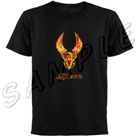
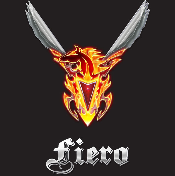
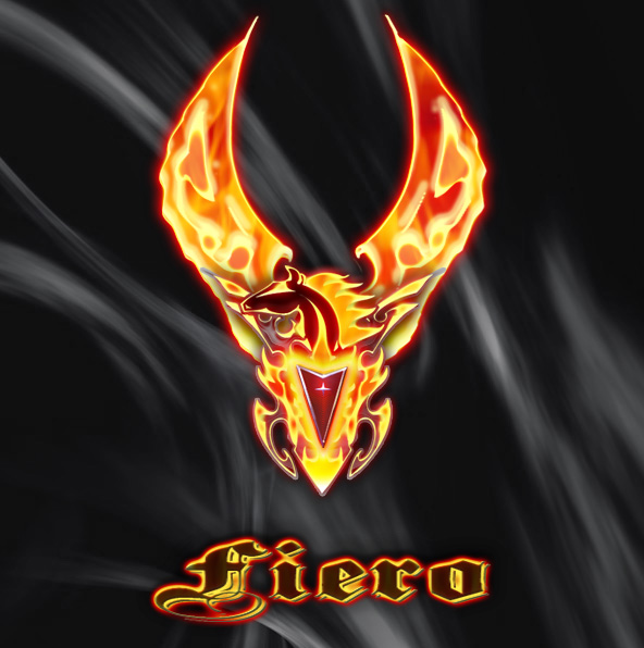
Is this better? I hate doing flames because I just can't seem to do a good job with the photo realistic- so I took a different route and went with this...
I still like the gothic font style, but maybe I can find a better font that complements the image. Hmmmmmmmmm...
IP: Logged
10:30 PM
Jul 3rd, 2006
naskie18 Member
Posts: 6258 From: Commerce Twp, MI, USA Registered: Jun 2002
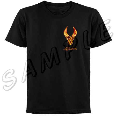
Is this better? I hate doing flames because I just can't seem to do a good job with the photo realistic- so I took a different route and went with this...
I still like the gothic font style, but maybe I can find a better font that complements the image. Hmmmmmmmmm...
Now that's freaking sweet looking!!!
How 'bout using the HemiHead font?
------------------ Nick www.naskie18.com GoogleTalk: nick@naskie18.com
I hate to make a request, but could you take the second pic, add the FIERO from the first pic, but change it so the bottom is orangish color, fading (if thats hat you can call it) into the silver color of what you have already.
Awesome pic man, i wish I could get my ideas out onto paper like that.
IP: Logged
12:22 AM
F-I-E-R-O Member
Posts: 8410 From: Endwell, NY Registered: Jan 2005
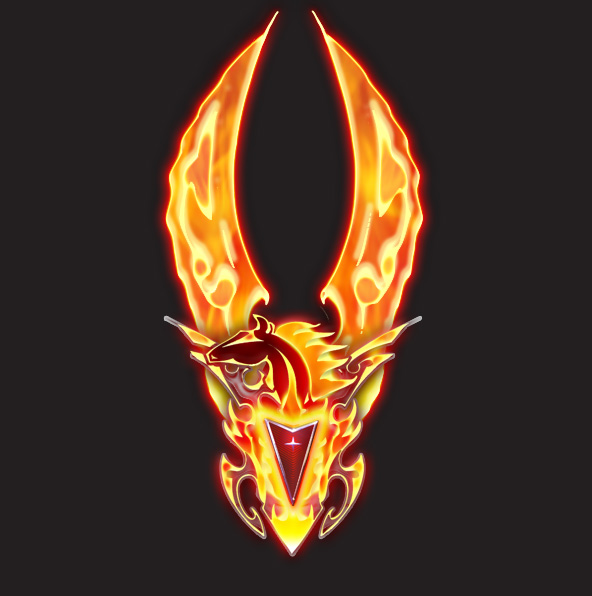
Originally posted by FieroRumor: My opinion : Widen the wings a bit.
Better?
I started playing with the font and made this by chance while playing with it, I kinda like the way it states what it stands for while not overpowering the image.
[This message has been edited by F-I-E-R-O (edited 07-03-2006).]
IP: Logged
12:45 AM
Amethyst Member
Posts: 946 From: Danville, IL, USA Registered: Jul 2005
Oh that is so NICE!! Are those going to be available from your Cafe Press Shop?? The family may just have to have matching T Shirts!! Woo Hoo!!
I liked all of the designs and the fonts... although the last font with the fire edge is perfect with the picture... would be very hard to chose one... lol..
I started playing with the font and made this by chance while playing with it, I kinda like the way it states what it stands for while not overpowering the image.
That's completely baddass!
edit: LOL (I looked at the filename after I posted this)
[This message has been edited by FieroRumor (edited 07-03-2006).]
IP: Logged
12:25 PM
F-I-E-R-O Member
Posts: 8410 From: Endwell, NY Registered: Jan 2005
That is way cool. I think the black T with the centered art could have bigger art. That art is worth a good look at any day of the week. It should be easy to see 20+ feet away.
Arn
IP: Logged
12:15 PM
RCR Member
Posts: 4454 From: Shelby Twp Mi Registered: Sep 2002
Please don't take this the wrong way, because I think your artwork is beautiful, but a flaming pegasus? That's more of a phoenix/firebird logo. I think it looks great but it doesn't go with the Fiero, unless you're making some kind of ironic joke.
Bob
IP: Logged
05:06 PM
F-I-E-R-O Member
Posts: 8410 From: Endwell, NY Registered: Jan 2005
I had someone ask me about a flamming Fiero that I had done before but wasn't quite happy with the result. I don't remember if I actually started this with the intention of making it flamming or not, but as I played with my PS styles, I found that I liked the look and went on with it. I'm going to play with it some more to see what it would look like without the flames/fire thing goin on... I thrive on constructive feedback, so don't ever hesitate to tell me what you really think- just make sure to include your address in the comment.
IP: Logged
06:14 PM
Mister Member
Posts: 1975 From: Calgary, Alberta, Canada Registered: Aug 2004
Originally posted by F-I-E-R-O: I thrive on constructive feedback, so don't ever hesitate to tell me what you really think- just make sure to include your address in the comment.
Hey man, you are one talented M.F Anyway, I love the design but I would try to make the wings follow the angle and flames theme of the "little wings" close to the horses head Something like this�
All rights reserved to F-I-E-R-O
I'm sure you can make it look right, if you wish� I will P.M you my address LOL
------------------
[This message has been edited by Mister (edited 07-04-2006).]
IP: Logged
07:38 PM
fierohoho Member
Posts: 3494 From: Corner of No and Where Registered: Apr 2001
on the wings, IMO you should show some trailing edge firey primary and secondary feathers but don't go overboard accentuating the flame curls, make it fuller but retain the angle..perhaps similar to the original design for the wings ..other than that the art work is quite nice ...
[This message has been edited by Erik (edited 07-05-2006).]
IP: Logged
01:31 AM
Jul 6th, 2006
tednelson83 Member
Posts: 1993 From: Santa Clarita, California, USA Registered: Jul 2002
wow, these are really good! do you have any other drawings?
oh, on you site, can you make a PFF shirt with the PFF logo and the PFF wording like it is at the top of the forum? i would really love a shirt like that!
------------------ 1987 Pontiac Fiero GT, 145,500 miles!decklid window, silver guages. rear ended someone, and now the rebuilding starts! saving for a norms front clip! :damon: More pics of my 87 GT can be found here 1985 Pontiac Fiero 2m4 auto, 221K miles and counting <-my first car, and i still cant get rid of her! 2002 Toyota Celica GT, 5-speed, 42K miles <-What a hunk of crap!
A 4 year olds knowledge of science: No matter how much jello you put into a swimming pool you still can't walk on water.
IP: Logged
08:16 PM
Jul 7th, 2006
F-I-E-R-O Member
Posts: 8410 From: Endwell, NY Registered: Jan 2005
Originally posted by tednelson83: wow, these are really good! do you have any other drawings? oh, on you site, can you make a PFF shirt with the PFF logo and the PFF wording like it is at the top of the forum? i would really love a shirt like that!
I have some PFF stuff that I made up on my Fiero Store. One of my very favorite PFF things is this mouse pad...


 fine work ,to a great job


 That's completely baddass!