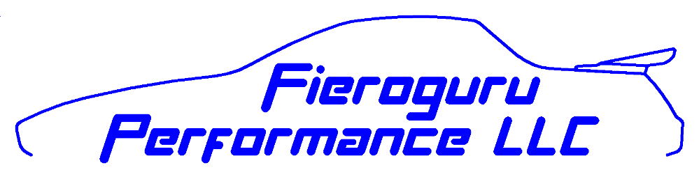
In the past few weeks I have been focused on developing a logo. I wanted something simple yet descriptive and after several iterations have narrowed it down to this. Let me know what you think!
[This message has been edited by fieroguru (edited 11-10-2017).]
Yes, the wing is non-stock. I think it is fitting for the outline to closely match my personal Fiero and I have a mustang whale tail wing in the basement that will be installed over the winter.
In the coming weeks I am going to see about having some t-shirts and vinyl stickers made up.
[This message has been edited by fieroguru (edited 11-10-2017).]
Some thoughts. I would try lessening the size of the text, and make the Fiero line bolder. I would put the Fieroguru and Performance on the same line, LLC could be smaller. THe Fiero line has some jagged bumps mainly around the spoiler, possibly if it was created in a higher resolution it would be smoother.
If you were looking for that kind of feedback.
[This message has been edited by 2.5 (edited 11-10-2017).]
I was able to make the car outline a little wider and make a sample with 2.5's suggestions. The jaggedness is byproduct of the system I used to draw them and not a resolution issue, but someone with photoshop could likely clean them up.
There are portions I like about each and when I surveyed the wife and girls we had a 50/50 split on which we like better. Edit: added an option C.
A:
B:
C:
[This message has been edited by fieroguru (edited 11-10-2017).]
Thanks for the feedback everyone. I am still torn between A & C (B is too tall). Both are good... but I am leaning towards C.
quote
Originally posted by mrfred8: Does it come in fastback? Just kidding, looks great!
Two funny things... 1. That is what Sara said... she has always been more of a fastback fan than a notchie person. 2. I did a fastback to notchie conversion for the outline (as well as aero to non-aero). When I made the first outline back in 2005 for my honeymoon trailer project, it was a fastback!
Above are ok for signage and maybe business cards... Logo? not so much. Lose bottom text because most shops do the same work. Many doing Logo work lose INC LLC etc as well.
Read about how USPTO works to give some data how they register Trademarks or use search to see examples. DuPont in oval shape outline is close to above... Not DuPont Inc Co etc.
logos like ComputeLand and Fiero are text, often w/ images too. Note that Fiero TM is not just used by GM... Exact appearance and just what use matters. Others can't put Fiero in/on a car w/o violating TM and having big problems.
ComputerLand is/was using Blippo Black font (Not sure exact font foundry used. Wasn't many at the time.) for selling PC etc.
------------------ Dr. Ian Malcolm: Yeah, but your scientists were so preoccupied with whether or not they could, they didn't stop to think if they should. (Jurassic Park)
To much going on try abbreviating. Or just name alone. Try shortening the brand eg buy fiero dot guru domain name. use a redirect back to your site all too much for a logo.
Originally posted by Flyboygt86: Paul how is my parts coming
I should have everything finished this afternoon and ready to ship Monday as planned. You should have pictures and a payment request later this evening.
I vectorized the image, and cleaned up the pixelation. I also used the Official Fiero font for the text. The stylized text, with the white lines, looks great on the screen, but would not look good when reduced and printed honestly..In this format, the image can be blown up to any size, and will have no degradation/pixelation.
If you want the vectorized file, just let me know a place / email to send it to.
Here is the cleaned up logo:
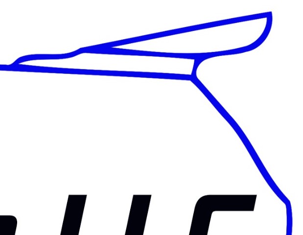
Here is just the Spoiler area blown up to show the nice clean lines:
I am going to go with option C but will do a few more tweaks. I appreciate the efforts to clean up the drawings, but I won't be changing to a different style text.
All of my work on this has been with AutoCAD with the intention of being able to use a ball tipped end mill to recreate an exact copy of my logo on a CNC milling machine.
I guess I'm in the minority as I like A because C has too much white space IMO. Also, I second or third the suggestion to drop the LLC and the bottom line of text. The bottom line of text could be added on a card or webpage, but for a logo I don't think it is needed.
[This message has been edited by Bob2112 (edited 11-12-2017).]
One more thought, does LLC, need to be there for legal reasons? It would fit nicer and FIero Guru Performance could be bigger, if it wasn't there...and could take up more of the white space.
[This message has been edited by 2.5 (edited 11-13-2017).]
Originally posted by 2.5: One more thought, does LLC, need to be there for legal reasons? It would fit nicer and FIero Guru Performance could be bigger, if it wasn't there...and could take up more of the white space.
Basically LLC is a INC but less issues/problems for many small companies and you don't see the suffixes on vast majority of company logos. Big item is Inc and LLC are to protect private assets from business assets unlike others types. Most will need this when someone sues because Businesses w/o protection then get sued find out they will go after owner's houses cars etc. (highlights see https://www.incorporate.com...ability_company.html ) Plus LLC might "flip into" an INC if/when company grows large enough (Possible but can be hard to do depending on State and type.) and then "Logos" and even URL's like ______LLC is a problem. Just losing LLC in a URL can very hard because ______ .com .org and other TLD's are likely registered already.
[This message has been edited by theogre (edited 11-13-2017).]