 
     |
| Next Fiero Geocoin (Page 7/9) |

|
hinesb1890
|
APR 08, 04:53 PM
|
|
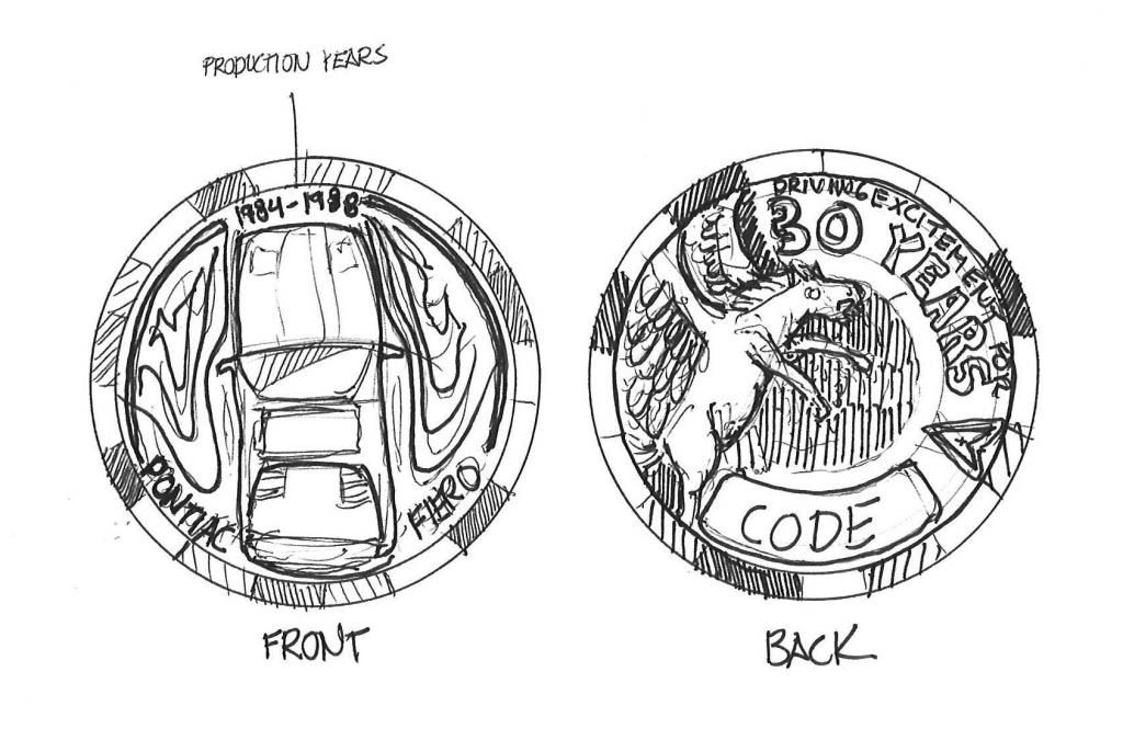
Ok here is a rough idea of a possible layout

It uses the coin edge RACE liked before
Front:
- top view of fiero
- production date at the top
- says "pontiac fiero" around the bottom
- pattern around the fiero is a mixture of airflow lines and an abstraction of the pegasus wings on the emblem, it is obviously not fully resolved in the picture
Back:
- real pegasus off to the left, using a real pegasus as opposed to the emblem will create some really cool textures that will look nice on the coin
- 30th anniversary wording around the edge
- code bottom center
- pontiac symbol break between wording and code
- could add a cool texture in the middle area or more wording that continues in the radial pattern
Feel free to give your thoughts/opinions and keep in mind this is rough and I can clean it up really nice and adjust the scale of things
|
|

|
JohnWPB
|
APR 09, 01:46 AM
|
|
I like Race's and hinesb1890's ideas about the 30th and all..... However  Are you going to change the coin again next year? In the past you have put different on the edge of the coin to commemorate things, such as the Tyler build, 25th Aniv. ect. If you put the "30th Anniversary" in the artwork, The coin would have to get new approval from GM, and be completely changed next year. Unless all future coins are going to be 30th coins Are you going to change the coin again next year? In the past you have put different on the edge of the coin to commemorate things, such as the Tyler build, 25th Aniv. ect. If you put the "30th Anniversary" in the artwork, The coin would have to get new approval from GM, and be completely changed next year. Unless all future coins are going to be 30th coins 
I also +1 that the coin be engraved. Having a picture on the coin just seems too simple.
|
|

|
hinesb1890
|
APR 09, 08:48 AM
|
|
|
Maybe since the 30th is only on one side, next year we only need to redo that side? If not what else can it say?
|
|

|
sadie goad
|
APR 12, 10:13 PM
|
|
I really like the idea for using a top view. I think it showcases some of the unique features of the Fiero. I would potentially move some of the text around, like putting the dates on one side and Pontiac Fiero on the other- I'd have to play with it in photoshop to see how it would look.
EDIT: I also like how on the back side of the coin, everything is moved around and not perfectly centered. It gives visual interest and a design that's very different from what we were previously using on the geocoin.
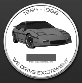
Purely for laughs, I found my original idea for the coin from when this project was first introduced, which is similar to an idea already posted:
 [This message has been edited by sadie goad (edited 04-12-2013).]
|
|

|
IMSA GT
|
APR 12, 10:25 PM
|
|
|
I'm trying to figure out what the tough decision is with the design. Other than the Tyler build, the coin should be the same every year minus the date. The coin design can remain the same.
|
|

|
JohnWPB
|
APR 13, 01:55 AM
|
|
[QUOTE]Originally posted by IMSA GT:
I'm trying to figure out what the tough decision is with the design. Other than the Tyler build, the coin should be the same every year minus the date. The coin design can remain the same. | |
The 'Tyler Build' coin was the same as all the others, just done in different colors to match the build, as well as text on the edge of the coin which differed on most of the coins, as it was the only thing that could be altered without GM's approval.
|


 Are you going to change the coin again next year? In the past you have put different on the edge of the coin to commemorate things, such as the Tyler build, 25th Aniv. ect. If you put the "30th Anniversary" in the artwork, The coin would have to get new approval from GM, and be completely changed next year. Unless all future coins are going to be 30th coins
