In the main thread on the awesome new lenses from Keith Goodyear, you may have seen the custom set I had decorated by RPM, that reads "BABY VETTE" in the Fiero Font. This is in addition to the "stock" set I bought as well.
I want to get another set or two, and after seeing some of the creative stuff in that thread (such as text on angles), and RPM telling me they can do just about any line-image I want, I've sort of hit "fear of missing out".
I still want to get a set that say "TURBO FIERO", likely in the Vijaya font (it's a font in the later versions of Word). I like it because it'll be clean to read when backlit at night, and has a little flair with it being italicized.
Of course, one of the issues is space, and TURBO FIERO is more letters than the normal font, I was also looking at the Rockwell Condensed font, which brings it in a little tighter without the letters being super-crowded.
I've also kicked around a few fun things, like finding a line drawing of a turbo to use on the "O"s.
Another thought I had was it to say "STOCK FIERO" with something akin to the "u mad, bro?" troll face at the end.
Ultimately, when RPM told me I wasn't limited to just fonts, and I could send them pictures and whatnot, and their guys could likely work it out... I'm just stymied. Ultimately, I'd like to keep them as "symmetrical" as possible. For example, my car's name has been Pandora for a long time (given by a friend), but PANDORA, no matter the font, would just look unbalanced because of space requirements (unlike PON TIAC, which looks closer thanks to the "I" in the second half saving room).
ANYHOW.... if I recall correctly, there's approx. 9" by 4" of space to work with on each lens. Any ideas, short phrasing, "symmetrically split" words, links to fitting/funny images, etc, please pitch them! I've been browsing through different decals and such for ideas, but can't seem to find a good layout to keep it visually symmetrical (as far as the total space taken up on each side).
If you want the Vette tail light look reference my post on the Corvette C4 light panel. It uses the oval lenses. If you want the Vette panel that uses the round lights I am told one will be available in about 60 days. Fieromotive (Jim Cleary) in St Petersburg, FL is the source.
------------------ " THE BLACK PARALYZER" -87GT 3800SC Series III engine, custom ZZP /Frozen Boost Intercooler setup, 3.4" Pulley, Northstar TB, LS1 MAF, 3" Spintech/Hedman Exhaust, P-log Manifold, Autolite 104's, MSD wires, Custom CAI, 4T65eHD w. custom axles, Champion Radiator, S10 Brake Booster, HP Tuners VCM Suite. "THE COLUSSUS" 87GT - ALL OUT 3.4L Turbocharged engine, Garrett Hybrid Turbo, MSD ign., modified TH125H " ON THE LOOSE WITHOUT THE JUICE "
Australian, not sure if you mean I should just leave the entire center section black, then? And take out the lights that are normally behind there?
Dennis - no, I'm not getting the Corvette style lenses, I'm referring to the ones being sold by Keith. But instead of it saying "PON TIAC" you can have custom stuff put there.
Like this
And this next one (which I sort of like in concept, having the letters angled helps me deal with my symmetrical OCD)
Or the set I already have:
I'm just looking for other things to do with the next two sets I want to get.
In my opinion, you have to be very careful with custom emblems or badging on a car. It can get very tacky, over the top really fast.
I haven't seen any custom tail light lettering that would tempt me over the stock PONTIAC. In my opinion it all looks slightly out of place. I think Fiero GT in the appropriate font could possibly look cool, but would be difficult to pull off with the seam in the middle.
That's just my opinion, and I'm not a purist, both of my cars are pretty heavily modified. Look at Chip Foose designs, he rarely adds emblems and lettering to a car, and if he does it's very subtle and makes you wonder if I came that way, or it's a very small custom touch like hand painting on the glove box door or something.
I was thinking of this myself, as I ordered a set of Keith's tail light lenses recently. But I opted for the stock look. All the other "ideas" I had to customize just came across as tacky. Sometimes "less is more"...we have all seen Fieros coverd in badges, logos, stickers, and it looks tacky. If I was to do a custom tail light lettering, I would keep the font vertical and similar to the factory font. Just my opinion.
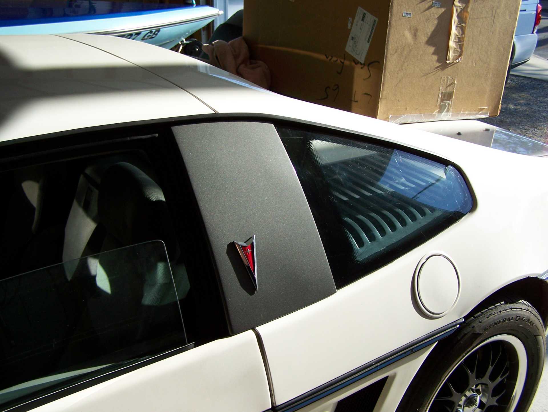
When you do custom stuff to your car- it is usually better to go subtle rather than extreme....Here are my custom "B" Pillars to cover the broken quarter windows.....
And this is why I want to have multiple sets, so I can swap them out depending on my mood, or what I'm doing with the car that day (I already have two or three tail light housings with unrecoverable lenses).
I'd agree with some of the above descriptions of some of the personalizations seen. Along with "tacky", juvenile and adolescent are some other good descriptors. The mods probably appeal to a group, but probably might not be the group that was intended. Some of the mods fall into the Rice genre.
That's a good idea... I will float that one and see what RPM says for the more "classy" custom set.
I have decided I am definitely going to do one of the custom sets as something completely ridiculous, utterly tacky, bordering on JDM rice/hoonigan. Simply for the fun of having them and throwing that set in when I go to some of the import/ricer heavy car gatherings, or when I take it to the track.
This is my juvenile car. My adult car is the one I drive to work everyday, my professional corporate-esque four-door sedan. And in two or three or ten years, if I grow out of the novelty of having the silly "Got Boost?" preceded by the picture of the turbo (or whatever I'm going to do)... I'll box 'em up, or mount them in my garage and run power to them as a wall decoration or something.
What has me really wondering; Why has the fart-can sound really caught on? I can understand 4 cylinder cars, but now they make V6s and even V8s sound like Fart-cans...I heard an SS Camaro the other day and it sounded like two hondas fighting (And both were LOOSING!)
And then the new auto trans quick shift with (Apparently) throttle cut....Whaaaaaaa-THPT-Waaaaaaa-THPT-Waaaaaaaa-THPT-...It sounds utterly terrible! For my Sports car, I'll take a manual trans, and for my V8 cars, I'll take the good ole V8 Rumble...(The other day I showed a neighbor kid my Jet boat- WARNED him, told him stand up by the bow...He still almost crapped himself when it started!)
I hear you (haha! sound puns!). I don't know why that caught on, but hey, it's their car, and they like it. When I talk to these guys at the shows, sometimes I ask about stuff I don't understand or don't like (though I'm usually polite enough not to say it to their face), and they usually just shrug and say they like it. Good enough for me.
Would I do that to my own car? No. The cam going into this engine is a touch aggressive, so it'll be a little loopy, or as my friend says, it'll sound like "potato potato potato potato". On my cars, I like the exhaust to be as quiet as possible without a huge performance impact. I like to listen to the radio when I'm driving, and exhaust note + competing stereo = headache very quickly.
Back when I was young many decades ago, we had what were called "Turbo-mufflers" which apparently were originally used on Chevy Corvairs...Very quiet until you really romped on it- then they would get loud.
My CVX-20 Jet boat has a 460 with a slightly hot cam......It idles smooth and quiet- usually when there are some wakers around me, in the marina....But when the sheriff's patrol comes by, then the engine starts to lope, just tryin' to get me in trouble!
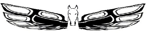
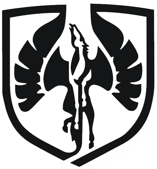
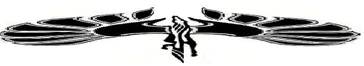
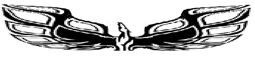
I think that with a design that is continuous like the stretched horizontal Pegasus or script that carries all the way across, there will be a blank area in the center. That center portion is filtered and won't be lighted. It will be a dead spot in the image.
First off- Sorry if I snicked your design Australian.....I was just looking for a good image online....
Second...the "Dead spot in the center" How about the wings glowing but the Horse being a chrome emblem stuck in the middle?
The stretched wings idea came from all of the T-bird emblems on Father's cars....He owned '59, '64 and 70 birds...
For emblems that don't glow, years ago I found out that Red and Gray do not go together well as far as our color vision- We have trouble focusing on those two colors together...It makes the image appear to vibrate...Here is my example;
Hey Trinten, I have been working on that design.....Originally made the "Coves" in the wings rounded- but that made it look like Bat wings, so I rebopped them to look like feathers overlapping...See what you think of this....
[This message has been edited by cvxjet (edited 03-25-2020).]
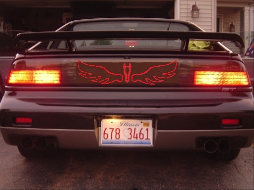
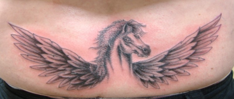
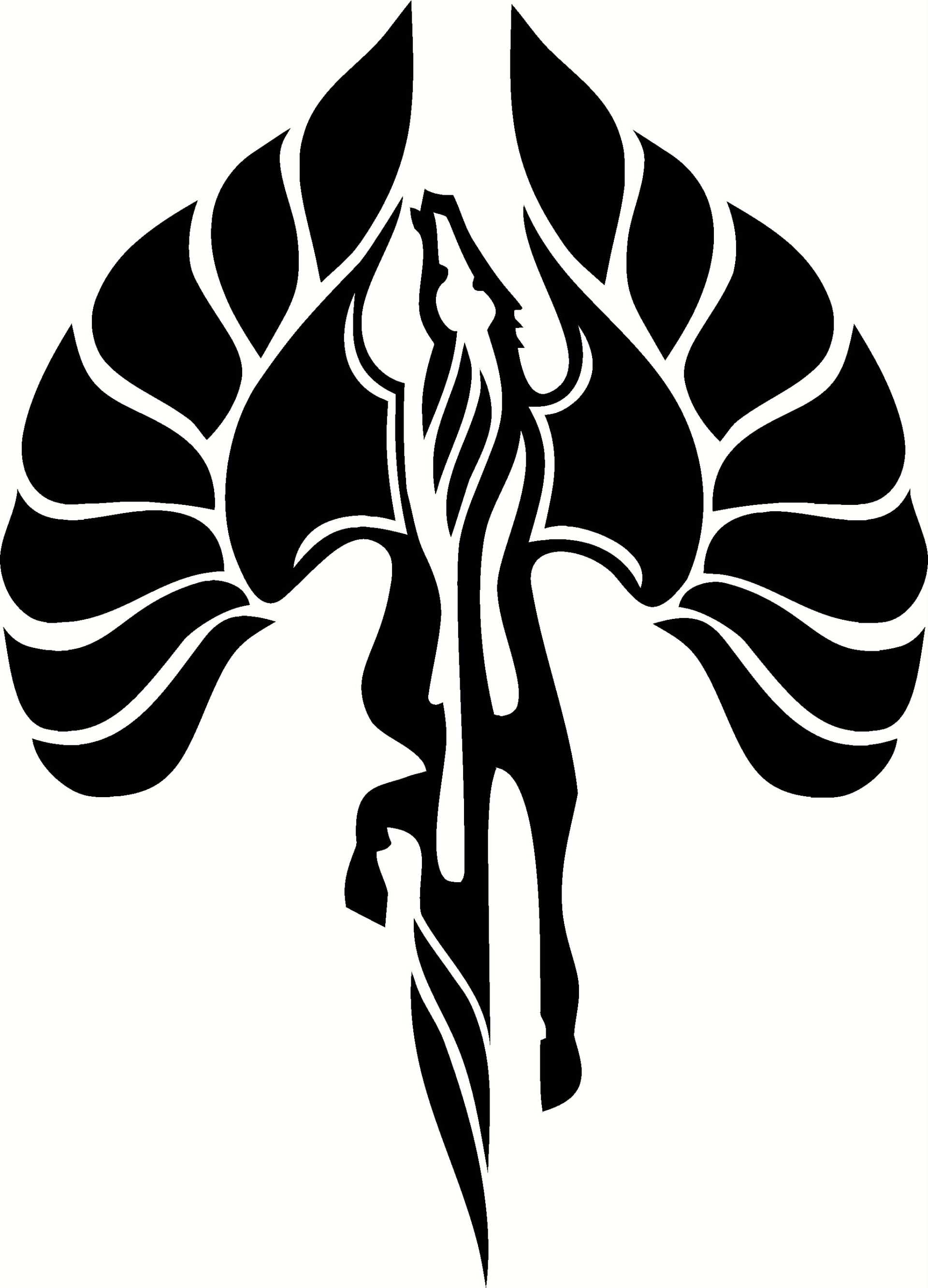
Not trying to be a dick, but those last few look like a bad tramp stamp to me... Personally, I think a simple "Pontiac" or "Fiero" evenly spaced looks best, but I go for more subtle designs on my car, IE when I get a new decklid that doesn't look like garbage, I'll get 2 sets of 2M6 labels, and make a "262" label, and if you didn't know any better, you'd think it's stock. same with the idea I had for Formula door stickers, I was thinking about getting Firebird Formula 350 stickers for a Thirdgen firebird, knocking the 0 off of the "350", and making a decimal to turn it into "Formula 3.5" for my car (which has a 3.5 L V6) unless you knew, it was custom, people would think it was stock.
Edit to add.
With those last few designs, most of the middle of the design will be lost by the gap in the taillights.
------------------ "I am not what you so glibly call to be a civilized man. I have broken with society for reasons which I alone am able to appreciate. I am therefore not subject to it's stupid laws, and I ask you to never allude to them in my presence again."
Not trying to be a dick, but those last few look like a bad tramp stamp to me...
I laughed so hard, I had tears in my eyes when I saw this. With all the crap going on in the world now, it is hard to find a good laugh. I was thinking the exact same thing... tramp stamp LOL ...
Thank you for the laugh. Made my day!!!
[This message has been edited by cam-a-lot (edited 03-31-2020).]
In my opinion, you have to be very careful with custom emblems or badging on a car. It can get very tacky, over the top really fast.
I haven't seen any custom tail light lettering that would tempt me over the stock PONTIAC. In my opinion it all looks slightly out of place. I think Fiero GT in the appropriate font could possibly look cool, but would be difficult to pull off with the seam in the middle.
That's just my opinion, and I'm not a purist, both of my cars are pretty heavily modified. Look at Chip Foose designs, he rarely adds emblems and lettering to a car, and if he does it's very subtle and makes you wonder if I came that way, or it's a very small custom touch like hand painting on the glove box door or something.
I agree. Makes sense!
Less is Better. More is Tacky.
[This message has been edited by Fiero Vice (edited 03-31-2020).]


.jpg)


.bmp)