
 
     |
| Visually creative people - please help me w/ my lenses! (Page 1/4) |

|
Trinten
|
MAR 09, 05:23 PM
|
|
Hi folks,
In the main thread on the awesome new lenses from Keith Goodyear, you may have seen the custom set I had decorated by RPM, that reads "BABY VETTE" in the Fiero Font. This is in addition to the "stock" set I bought as well.
I want to get another set or two, and after seeing some of the creative stuff in that thread (such as text on angles), and RPM telling me they can do just about any line-image I want, I've sort of hit "fear of missing out".
I still want to get a set that say "TURBO FIERO", likely in the Vijaya font (it's a font in the later versions of Word). I like it because it'll be clean to read when backlit at night, and has a little flair with it being italicized.
Of course, one of the issues is space, and TURBO FIERO is more letters than the normal font, I was also looking at the Rockwell Condensed font, which brings it in a little tighter without the letters being super-crowded.
I've also kicked around a few fun things, like finding a line drawing of a turbo to use on the "O"s.
Another thought I had was it to say "STOCK FIERO" with something akin to the "u mad, bro?" troll face at the end.
Ultimately, when RPM told me I wasn't limited to just fonts, and I could send them pictures and whatnot, and their guys could likely work it out... I'm just stymied. Ultimately, I'd like to keep them as "symmetrical" as possible. For example, my car's name has been Pandora for a long time (given by a friend), but PANDORA, no matter the font, would just look unbalanced because of space requirements (unlike PON TIAC, which looks closer thanks to the "I" in the second half saving room).
ANYHOW.... if I recall correctly, there's approx. 9" by 4" of space to work with on each lens. Any ideas, short phrasing, "symmetrically split" words, links to fitting/funny images, etc, please pitch them! I've been browsing through different decals and such for ideas, but can't seem to find a good layout to keep it visually symmetrical (as far as the total space taken up on each side).
Thanks!
|
|

|
Australian
|
MAR 10, 02:21 AM
|
|
|
I think the lettering makes it all look crap. The only person that will like it will be owner I would be embarrassed over it.
|
|
|
|
Dennis LaGrua
|
MAR 10, 07:52 AM
|
|
|
If you want the Vette tail light look reference my post on the Corvette C4 light panel. It uses the oval lenses. If you want the Vette panel that uses the round lights I am told one will be available in about 60 days. Fieromotive (Jim Cleary) in St Petersburg, FL is the source. ------------------
" THE BLACK PARALYZER" -87GT 3800SC Series III engine, custom ZZP /Frozen Boost Intercooler setup, 3.4" Pulley, Northstar TB, LS1 MAF, 3" Spintech/Hedman Exhaust, P-log Manifold, Autolite 104's, MSD wires, Custom CAI, 4T65eHD w. custom axles, Champion Radiator, S10 Brake Booster, HP Tuners VCM Suite.
"THE COLUSSUS"
87GT - ALL OUT 3.4L Turbocharged engine, Garrett Hybrid Turbo, MSD ign., modified TH125H
" ON THE LOOSE WITHOUT THE JUICE "
|
|
|
|
Trinten
|
MAR 10, 10:07 AM
|
|
Hi guys,
Australian, not sure if you mean I should just leave the entire center section black, then? And take out the lights that are normally behind there?
Dennis - no, I'm not getting the Corvette style lenses, I'm referring to the ones being sold by Keith. But instead of it saying "PON TIAC" you can have custom stuff put there.
Like this
.jpg)
And this next one (which I sort of like in concept, having the letters angled helps me deal with my symmetrical OCD)
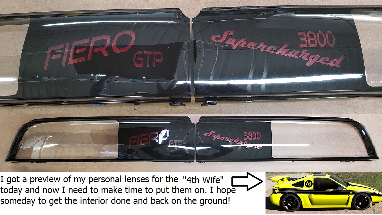
Or the set I already have:

I'm just looking for other things to do with the next two sets I want to get.
|
|
|
|
zmcdonal
|
MAR 10, 12:49 PM
|
|
In my opinion, you have to be very careful with custom emblems or badging on a car. It can get very tacky, over the top really fast.
I haven't seen any custom tail light lettering that would tempt me over the stock PONTIAC. In my opinion it all looks slightly out of place. I think Fiero GT in the appropriate font could possibly look cool, but would be difficult to pull off with the seam in the middle.
That's just my opinion, and I'm not a purist, both of my cars are pretty heavily modified. Look at Chip Foose designs, he rarely adds emblems and lettering to a car, and if he does it's very subtle and makes you wonder if I came that way, or it's a very small custom touch like hand painting on the glove box door or something.
|
|
|
|
Formula
|
MAR 10, 03:06 PM
|
|
I would just do the pegasus on the passenger side taillight, leave the driver side solid black[This message has been edited by Formula (edited 03-10-2020).]
|
|
|
|
cam-a-lot
|
MAR 10, 03:42 PM
|
|
I was thinking of this myself, as I ordered a set of Keith's tail light lenses recently. But I opted for the stock look. All the other "ideas" I had to customize just came across as tacky. Sometimes "less is more"...we have all seen Fieros coverd in badges, logos, stickers, and it looks tacky. If I was to do a custom tail light lettering, I would keep the font vertical and similar to the factory font. Just my opinion.
Good luck with your mod
|
|
|
|
cvxjet
|
MAR 10, 06:12 PM
|
|
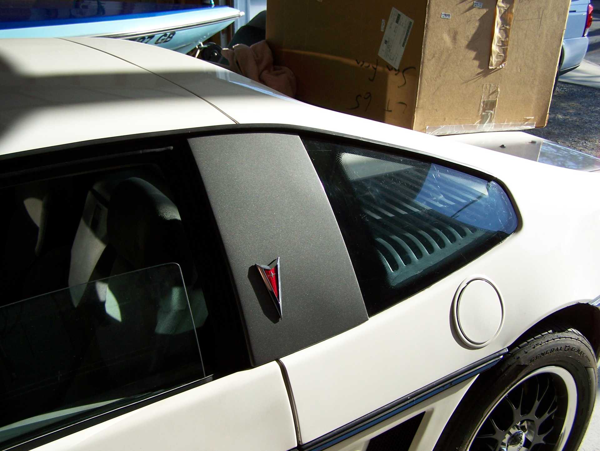
When you do custom stuff to your car- it is usually better to go subtle rather than extreme....Here are my custom "B" Pillars to cover the broken quarter windows.....
|
|
|
|
Trinten
|
MAR 10, 08:52 PM
|
|
Thanks guys,
Formula - that's a good idea!
And this is why I want to have multiple sets, so I can swap them out depending on my mood, or what I'm doing with the car that day (I already have two or three tail light housings with unrecoverable lenses).
|
|
|
|
sourmash
|
MAR 11, 08:52 AM
|
|
|
I'd agree with some of the above descriptions of some of the personalizations seen. Along with "tacky", juvenile and adolescent are some other good descriptors. The mods probably appeal to a group, but probably might not be the group that was intended. Some of the mods fall into the Rice genre.
|
|
|
|